Forum Replies Created
-
AuthorPosts
-
nesgran
ParticipantYou don’t say, any chance of posting just a bit more spam?
October 20, 2014 at 2:35 am in reply to: I've scheduled a 1st communion gig in May-15: HELP !! #22850Participantwatch the B&H videos about portraits and wedding work. Some of them are really, really good and full of tips. If you haven’t, I’d get a medium sized umbrella, lightstand and stick a flash in there. Depending on how many people are in the groups you may need two. It is not so much to light up and provide all the light for the group portrait but more if the light is a bit boring in the church. If the sun is in the wrong place you only get soft, diffuse darkness which makes for pretty poor photos. On the other hand if you get lucky you get wonderful soft side light streaming in through the windows. Also if you have too much flash it will darken the background.
You have loads of time so next time you have friends over, get practicing and send them an 8×10 as thanks for their help.
ParticipantFocussing in live view is really only useful if you are shooting things that aren’t moving and generally only on a tripod. It is great for macro or product work but less so for portraits.
What I mean with front focus can probably best be explained with this shot http://jessicarachelo.smugmug.com/Kids-and-Babies/i-4pHJXdJ/A . Camera AF will, if you let it, select the closest point within the AF pattern (within reason) that has the highest contrast. Her black and white jumper is a perfect AF target and this is why her sleeve is sharp but the kids eyes are soft. This shot in particular is suffering a bit with perspective. It looks as if you’ve used a fairly wide angle lens to fit the three of them in which has distorted the perspective somewhat and made her arm big and their noses bigger than expected. Looking at it again (on a colour calibrated wide gamut monitor) it has a quite obvious green colour cast. Last time I checked it was on my cheap TN screen where it wasn’t very obvious. The skin tones aren’t great and uneven. Are you using a grey card during your shoots? Have you got a proper screen that is colour calibrated? If you don’t have these things that would be a strong suggestion of mine to get and that pretty quickly. Nothing good is going to come out of having wonky colours. In fact your self portrait has some of the same problems as the shot I linked (short focal length and green colour cast)
As for the focussing, it is vital not to let the camera do the selection apart from in some settings like fast paced sports with long teles or kids in some circumstances. As for one shot vs servo, have a look in the camera manual and it’ll explain it far better than I can but basically one shot is for static subjects and servo is for things that are moving. Toddlers often benefit from servo focussing given their tendency to run about. What camera are you using? Some will have a lot more tweaking of the AF system possible than others.
Your website makes a lot more sense now and is easier to navigate. It looks clean and modern and works really well with the beach theme. The shot of the dad carrying his kid towards the water is lovely and sets a nice tone. I would probably get rid of the little specks which I’m guessing are birds as I started scratching on my screen thinking I had bits of dirt stuck on it.
I would also suggest making yourself familiar with printing the photos as you will need that if you want to take it further than short sessions for a hundred bucks. It will also give you a far better source of revenue if you have decently priced prints available made at a proper pro lab. I would suggest printing yourself a portfolio in good size, either 8×10 or 11×14 because this will also be a great selling point if you have a coherent paper portfolio. For printing a colour calibrated monitor is essential. Before you get them printed I’d suggest re-editing the lot with all you’ve learnt since you started and make sure they are consistent in both colour and contrast. When you put them back on your website it will look more consistent and professional.
Good luck and make sure you pay your taxes and insurance!
ParticipantI would suggest you do a few more sessions for free until you’ve built up a slightly wider portfolio but also sorted out some of your issues.
First off, your website is arranged in a really bad way for someone who is looking to use you as their photographer. It would make a lot more sense if you split it in to categories rather than sessions. I would also strongly advise ditching the mahoosive watermark you have on your photos. On facebook yes but not on your “own” website, it just looks insecure. Who is going to steal your photos? Secondly, offering colour and black and white versions to the client is fine but showing them both on the website offers nothing. Personally I don’t like seeing B&W and colour on the same page, it is jarring. By all means have a black and white section if you want.
Coming to the actual photos there are problems with them as well, some as they were taken and some that are afterwards. I see you are going for the low contrast hazy look which is popular at the moment. Problem is that you aren’t doing it consistently, even within one session. Secondly you have some focus issues. I see both front and back focussing. Are you letting the camera select the focus point or are you doing it manually?
You have done well with the lighting and the feel of this images though. I think you are doing well but could use a little more practice and also be a little more self critical.
I looks like all I saw was natural light which is fine but some shots (like the two girls on a blanket in a forest) would have been better with a little fill light from a reflector on a stand.
ParticipantA shutter speed of 1/80 would not generally be enough to use the 70-200 and get sharp photos. Especially if you use it on a crop body. F4 200mm has thin depth of field no matter though. Heck I go to f8 quite often at 150ish mm to get enough depth of field and that is where the IS really shines.
The bokeh difference between various lenses can be down to far more than the aperture used though. The entrance pupil will affect the shape of the bokeh even at the same focal lengths and aperture. Bigger front elements do better. The f2.8 will also focus quicker in worse light and it will let the camera activate more cross type points. There is no question that the 70-200 f4 non-is represents tremendous value though.
ParticipantWhat they really need to do is sort out their registration to stop the spambots. That and a moderator that is actually active on the forums
Participanthttps://www.facebook.com/pages/Rose-Photography-by-Lisa/444633848936513
Surely nothings screams dedicated pro like a rebel with kit lens and pop up flash at the ready?
ParticipantIt doesn’t end there. She’s got lots of photos of kids sat on active rail tracks, great.
ParticipantAre you mad, stop it and go away!
ParticipantDownload the trials for elements and lightroom and see if it works for you. If you are a student a lightroom licence is cheap and for what you are doing will work for at least 98%* of what you need it to do
Obviously my own made up statistic but the times I’ve opened photoshop lately are far between.
ParticipantI think you are off to a really good start, you have a pretty good eye for it. The main problem is that your photos tend to be far oversaturated. If you are aren’t on a colour calibrated or at least a monitor that is vaguely right that would be my first suggestion.
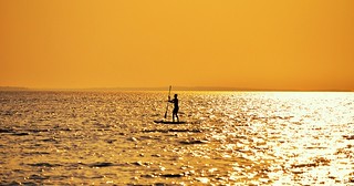
Things I think you could improve on is mainly to do with framing. In the shot below you could have used the negative space better and not plonked the surfer in the middle of the shot and the horizon in the middle. Try cropping the surfer in so he is the bottom right rule of thirds intersection. There’s obviously many more ways to frame than rule of thirds but it is a very very good place to start. I’d clone stamp away the bird just over the horizon to the left as well.
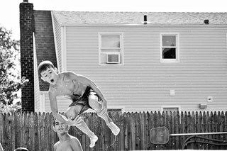
The shot below could have used more context. It is implied there is a pool under him but I think it would have been a lot better if you could see the top of the water. Expression, contrast and sharpness is there though.
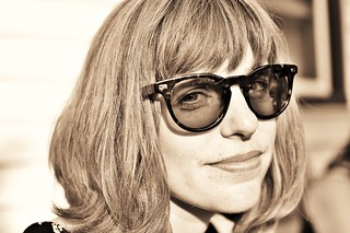
Shots like the one below aren’t flattering. The short focal length combined with the short distance to the subject makes her nose look very big. Take a couple of steps back and use a longer focal length for headshots.
I love this one but you need to sort the tilted horizon out
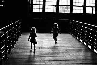
Here’s another one that is great but where you could have used the dead space more effectively
If you’d waited until this lady was looking the other way the photo would have made more sense. Now she is looking intently the other way so it feels like you are missing something. Shame you didn’t take this with a better camera. It is over saturated and the skin tones are off.
I like the expression on this one but it is a bit soft because focus has ended up on her hair rather than eyes. Always make sure the eyes are the sharpest portion of a portrait unless you consciously go for focus elsewhere

The photos look nice but who is you target clientèle? At the moment everything is different which is great for learning but who would pay you to take photos? Keep learning from your mistakes, start to learn about augmenting the light available and sort your colour issues out and you will get there one day if you are dedicated enough.
ParticipantSo, from what I can work out most of the photos I can see there aren’t yours apart from the quite bad retouch job where you’ve made a woman look like she was plastic?
Put the photos you want looked at in a flickr account so we can see them properly.
ParticipantPaint the walls a pure shade of grey or white, it will save you headache in the long run. It depends a bit on your lighting what is the best colour. If you are using shoot through umbrellas you may want grey walls to be able to shape the light as you want but otherwise white will work. If you want to put colour on the walls in the bedroom just add gels to your lights, it’s not like you are going to be using the light bulb in the ceiling anyway. The only colour I’d consider would be a pale yellow but only in the bedroom. If you can get 18% without any colour cast and a colour that won’t take on a hue over time that would be easy to work with without being too dark. White on the other hand will have the advantage of making the space look bigger and more modern which is not to be sniffed at.
Participantwow, those were stunningly bad wedding photos, I feel sorry for your friend. You could at least have hoped he’d sort the dress situation out in post and not turn everyone’s face into plastic before posting online, especially posting before and after shots. I wonder what the bride’s maid who had the liquefy job on her neck is thinking
August 28, 2014 at 12:17 pm in reply to: What is the Value of a Good Photograph/Photographer? #21808ParticipantCan you please stop spamming your website for traffic, it is getting tedious
-
AuthorPosts