Home › Forums › Photography Showcase › Which One Should I Print for My Portfolio Book?
- This topic has 7 replies, 4 voices, and was last updated 10 years, 8 months ago by
Bill.
-
AuthorPosts
-
August 15, 2013 at 9:03 pm #11948
JanJan
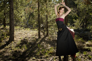
ParticipantI keep a black portfolio book where you can insert 8.5×11 pictures. I am torn between these 2 images, which I consider one of best works at my stage (I’m pretty new). It’s with the same model and same settings, but different poses. Well here are the pictures:
Option 1 – This is on my portfolio website – http://www.photosbyanjanette.com
http://www.flickr.com/photos/anjanette_ablis/9493000140/
Option 2 – I feel the lighting is a bit more artistic, and received comments when I posted this on Facebook versus the other one (both on my photography page and a photographer’s group board)
http://www.flickr.com/photos/anjanette_ablis/9490202505
Any critiques will be great as well.
By the way, I had some assistance with an photography pro with about 18 years of experience. She suggested the settings and held the flash for me, as I didn’t have a light stand.
August 15, 2013 at 10:32 pm #11952cameraclicker
ParticipantLight stand for flash: http://www.henrys.com/12371-NIKON-LIGHTING-UMBRELLA-KIT-W-CASE.aspx , the link is to a Canadian page. Check with B&H or your favourite store, you can probably get it for less. If you want a softbox instead of an umbrella, check for Westcott gear, they make several for small flash that come with a stand.
Regarding a critique, as I stated before, I am not a fan of the low contrast light on the front element look, so my view is the first image as you have on your page is better. Both images seem to have her toes chopped off! And, the one I like because of the contrast also has her fingers chopped off? In that one, I might be tempted to burn the forest floor because it is pretty bright and also I would burn her arm pit, chest and upper arm for the same reason. I would try making her face just slightly brighter than the rest, but not noticeably so. I think I would also run the blur tool set to 5 or 10% over the forest to dial back the sharpness of all those needles a little.
In the second one, the tree behind her has suddenly become less healthy and turned brown? The forest floor is still a bit too bright.
In the woods we have here, she would be eaten by the bugs if she exposed that much skin. I have never come across anyone dressed like that in the woods.
August 16, 2013 at 1:33 am #11955ParticipantThanks for the input! The good thing about getting reviews, especially from you, is that you spot things that I would never have guessed that I would need fixing. I re-edited the images based on your suggestions, and they look better even with the subtle changes. I deleted the old ones and re-uploaded them again, so unfortunately, the pictures from my original post are now gone.
Option 1
Option 2
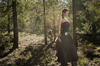
I was actually leaning towards Option 1, mostly because it’s composed better than Option 2, in my opinion. In Option 1, her toes were not cut off, but her hand was. I knew this was going to be mentioned! LOL! I guess my 35mm was not wide enough to get her entire 6-foot frame (6’3 with her heels, and probably almost 7 feet with her arms up).
This was taken at Mt. Charleston, which is about 35 miles north of Las Vegas. Because the air is dry, there are not as many bugs compared to areas with more humidity. However, earlier that day, the model was leaning against a tree and had ants crawling all over her back and dress. Also, this shot was taken during a fashion photography meetup. It was a shoot-out with multiple photographers taking a picture of one model. She wanted to go for the “Steampunk” look, so she picked out this outfit. Of course, no one would normally wear an outfit like this in the woods, but when it comes to a “fashion” shoot with a model, anything goes with regards to wardrobe.
The lighting was pretty harsh and the meetup organizer realized we should have started later with better lighting.
Also with Mt. Charleston, a month before there was a forest fire that lasted for almost 2 weeks, which is probably why the trees looked a bit dead. Luckily, the whole entire mountain area did not looked as burned as a I thought!
August 26, 2013 at 2:31 am #12295Bill
ParticipantHello Anjanette, love the concept. The model looks great, the woods are fine.
With option 1 – I agree with Cameraclicker with her fingers being cut off. The only other thing that I find annoying with the image is the tree behind the model. It makes it appear as if she were bound to the tree or the tree is somehow propping her up. I think, and this is just my opinion, if she were re=positioned either to the left or slightly to the right, so that the tree were not directly behind her, it would make the image much better.
With the flash, I see one minor thing, the harsh shadow on the models right side, especially under her armpit and above her breasts. Don’t know the location where you were shooting and the equipment that you have at your disposal, but if I were to do this over, I would use another flash positioned high to the models right side shooting down slightly to counter the shadow or a reflector, preferably gold, since the model looks fair-skinned. SInce I don’t know the particulars of the location and the nature of the shoot, that is just my opinion based on what I see.
Option 2 – I would not use at all due to the big lens flare dead center. Not sure if was intentional or not, but it seems very distracting and it just robs the color from that area.
Not sure if I get the Steampunk vibe from this scene and dress, more on the side of fashion meets nature but definitely not Steampunk, but hey that wasn’t your call from your story.
I hope that you take this criticism well, as it is definitely not meant to be cruel or mean in any way. Looking at your flickr stream, you got a good eye and seem to execute well.
August 26, 2013 at 6:05 am #12297Worst Case Scenario
ParticipantI’m not a fan of the washed out lens flare look either – BUT the pose in the first shot looks a little contrived and ( once I mention this you’ll never be able to unsee it! ) she appears to have 3 legs!
August 26, 2013 at 8:32 am #12299ParticipantLOL! Yes, in the thumbnail I see 3 legs! Size makes a difference. In the larger image on Flickr, I still only see two legs.
August 26, 2013 at 7:45 pm #12316ParticipantThanks for the feedback everyone. I take criticism very well because I know it makes me a better photographer. I got a lot of compliments for this picture, but it was coming from just regular people. Getting critiques from fellow photographers is helpful because it helps me pay attention to the details that I would normally not pay attention to. Like the fact that yes, it does look like she has 3 legs :::facepalm:::.
Like I mentioned before, this was taken during a shoot-out with multiple photographers to one model. Not many people were giving directions, so the model was just posing away. She just ended having her arms up, and when I showed her the picture from my LCD screen, she wanted the picture. So I gave it to her. I didn’t direct her to have her arms up like that.
Another thing I didn’t mention before was that that the organizer of this shootout asked us to only bring our camera and one flash. She didn’t want anyone to bring their whole setup. At the time she set this up, she was uncertain whether or not we needed a permit to shoot. It wasn’t until a couple days later before the event that she was told she will need a permit. She didn’t want to cancel the event, so she just continued to have the meeting anyway and found a location where we can hide if a ranger showed up.
Also, the assistance from the photographer pro (who was actually the organizer) was really fast. We didn’t want to hold up anyone’s time, so it was just a 5-10 minute thing between myself, the model, and her.
If I were to do this again, I would have waited until it got darker. I probably would have gotten away with just a reflector and light stand because this shot was taken at a bottom of the hill and the road was up top.
August 26, 2013 at 10:05 pm #12322ParticipantI take criticism very well because I know it makes me a better photographer. I got a lot of compliments for this picture, but it was coming from just regular people.
I am glad that you are open to criticism and take it well. We all make mistakes and in cases like this where we don’t have complete control over the flow of the session, you sometimes have to “spray and pray”. It’s not pretty but you have to do what you have to do to get the job done. It sucks when you have to try to get a concept in your mind but don’t have the time or equipment to execute it the way you want. The permit issue can be tricky sometimes, depending on your venue, trust me, I know where you’re coming from.
I am by no means a a stellar photographer, I do okay and am always trying to improve. I also do the proverbial :::face-palm:::, but that’s how we learn and progress. The ones that don’t listen or critique back at wanted criticism are the ones who should probably re-evaluate their profession, you by far are not in that category.
I always hate having photos critiqued because you never know what your going to get. I welcome open and fair criticism but hate getting that “great shot” or “Lovely” as a critique from other photogs. Why you may ask? Because it sounds like a generic gesture at not hurting your feelings while not offering any true advice. On the other hand, you may sometimes get that cruel and somewhat hurtful critique that points out all your flaws but at the same time bashing you down on a personal level.
My approach, observe, critique and advise. Simple as that.
Good Luck Anjanette, you do good work.
-
AuthorPosts
- You must be logged in to reply to this topic.