Home › Forums › Photography Showcase › these 2 didnt show up in last post. please critique, don't hold back
- This topic has 5 replies, 5 voices, and was last updated 10 years, 6 months ago by
jermyster.
-
AuthorPosts
-
October 6, 2013 at 5:56 pm #13997
jermyster
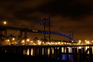
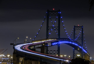
Participanthow can i improve on these also unsure about composition
 October 6, 2013 at 10:45 pm #14000
ebi
Participantfirst one, shoot earlier in the day, at dusk. WOuld probably be much more beautiful.
second one. too bad about the clouds at the top. otherwise it would be just about perfect. Quite gorgeous. Love it. I think a little earlier would work as well. You want some color in the sky.
October 7, 2013 at 1:06 am #14003Bill
ParticipantI know this bridge – if I am not mistaken, it is the Vincent Thomas Bridge that connects Long Beach to San Pedro, very nice area for those industrial shots.
I was going to add that the first one looks a little too warm to me, but you have a problem with trying to correct the lighting. That area uses a lot of harsh mixed industrial lighting that does not help trying to capture the correct color very well. You can see the orange glow from the sodium halide lamps at the base of the bridge and in between some of them are some mercury vapor and/or high intensity fluorescent lights that throw off a extremely white to green tint.The reason I bring this up, is going with a night shot poses color correction hurdles that are not easily remedied, throw in some light cloud cover and you intensify the light glow problem. The clouds act as a giant ass reflector in the sky.
Going with ebi’s idea and shooting earlier in the day can overcome that or use a composite image shooting the sky during the day and the bridge at night, maybe?
I like the images, the composition is better with the second one, IMO, but good vantage points are not the greatest for this bridge.
In the 2nd photo, noting major, there is a leaf or something in the upper right-hand corner, should probably be cloned out. Looks like it was not intentional like a gobo.Nothing to do with your photos, but isn’t this the bridge that Tony Scott committed suicide on? not that it matters any.
Nice shots, I think.
October 7, 2013 at 2:19 am #14007nesgran
ParticipantI agree with the others above and again you have far too much noise in the shot and this time you can see a dust spot on the sky as well, time to clean your sensor!
October 7, 2013 at 6:48 am #14008cameraclicker
ParticipantThe yellow photo needs better white balance and some fill light, which is probably best added in post, to make the foreground posts stand out more but not enough to show any detail in the rocks, bricks, whatever, in front of the posts. There is some noise but once the lighting is fixed it is a pretty nice photo.
The second one is leaning to the right. I agree with the comment about removing the leafy branch. I like the cloud.
@Bill, according to Wikipedia, it is that bridge.October 7, 2013 at 4:37 pm #14020Participantwow thanks for all the advice that really helps, i’ll continue trying, but will used your advices. thanks everyone. i can see the recommendations and what you guys see now.
again thanks i highly apprecaite it.
and yes its the one he jumped off of.
-
AuthorPosts
- You must be logged in to reply to this topic.