Home › Forums › Am I a Fauxtog? › Ok, A Re-Edit of one of My Favs
- This topic has 17 replies, 7 voices, and was last updated 11 years ago by
creyes8519.
-
AuthorPosts
-
April 4, 2013 at 10:46 pm #8603
simoncookerussell
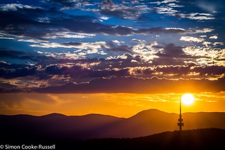
ParticipantHi guys, I know we got off to a bad start, but a new start is needed, so here Im going to show you my Favourite sunset pic I took recently, being as I never photograph Humans, I have a few but, anyway, these are the kind of images Im mostly fond of and want to perfect.
Tell me what you would do here, and I have a crack at it. Ive just reorganised my LR4 with all my pics in Collections, so keeping track of edits in process will be better from now on.
Time for a new start.
First one, and I promise, I wont bite. This will be my last chace to redeem myself, so please give me another chance.
Cheers
April 4, 2013 at 11:39 pm #8607fstopper89
ParticipantI like this one a lot. I think the heavier saturation works with most sunset shots such as this. The whites in the clouds do not seem blown out. Maybe lessen the vignette ever so slightly, but vignettes are kind of a personal preference things as well. I enjoy sunset shots where an object is in silhouette.
April 4, 2013 at 11:47 pm #8608ParticipantApril 5, 2013 at 12:06 am #8610ParticipantThanks for that, but it was prolly too much of an easy shot do you think?
Might have to make it a harder challenge.
April 5, 2013 at 1:01 am #8614ParticipantIn my experience, sunsets can be difficult and they can be easy. They are typically full of color, which is a huge plus, but it can be difficult to expose properly when you have lots of lights and darks and you can’t really go off of the camera’s light meter when shooting into the setting sun.
A “boring” sunset photo is just a plain old cloudless sky with a sun on a horizon. An interesting sunset photo is what you have here. A stunning sunset photo is when you can also incorporate more elements into the photograph, like pattern, texture, etc. I shot one of my favorite sunset photos last spring, where I lined up several windmills in a successive pattern in silhouette. Not necessarily saying my particular photo was stunning, but it was something less-than-average. Search “sunset” in Flickr’s search, or “silhouette” and you might get some good ideas.
April 5, 2013 at 1:32 am #8616Loke
Participantpurty and I second what brown eyed says….
April 5, 2013 at 3:13 am #8619ParticipantOk, I took another pic that I knew would be (for Me) a pain in the ass to get right in PP,and a pain of a picture to expose properly when taken.
So what are the opinions firstly, of the original pic, and could it have been taken better in camera
F/22
1/25
ISO100
50MM
The picture was taken free hand, so the focus is prolly not the best, but in focus or not, this type of picture are the ones that are generally my undoing in shooting and PP.The picture was taken specifically to be criticised, so go for it. Just remember, the focus issue would be different if I was being serious about it being a keeper and I would have used a tripod, but like I said, its the kind of Picture like this, with is all variying contrasts, that I have a hard time dealing with.
Before
http://www.flickr.com/photos/94214228@N05/8620431685/in/photostream
After
http://www.flickr.com/photos/94214228@N05/8621534456/in/photostream
April 5, 2013 at 4:21 am #8622JanJan
ParticipantI’m glad you continued to keep on shooting, because your work is actually good. It would have been bad if you stopped, especially since it apparently makes you really happy. The sunset picture is beautiful. I would edit it in a similar fashion.
Saturation really works in your sunset picture, but saturation doesn’t work in other cases. For instance on this picture, because I am huge fan of vibrant colors, I REALLY wanted to make this more orange-red. The area is called Valley of Fire, and I really wanted a richer orange-red to represent the area’s name. But it would have been bad for skin-tones, especially on the girl, so ::sigh:: I had to desaturated it a little and cool down the tint. (http://www.photosbyanjanette.com/wp-content/uploads/2013/03/santosfamily2.jpg)
I’m all for a clean slate, and since we’re on the same boat, perhaps we can help each other out.
April 5, 2013 at 5:02 am #8623ParticipantDid you try using a mask for the people in Photoshop or Lightroom. At least you could have adjusted the rocks temps without affecting the people.
April 5, 2013 at 8:03 am #8624ParticipantMy original photo was a bit under-exposed and had some shadows, so the original edit was done in Lightroom. I’m new to Lightroom, but I’m proficient with Photoshop because of my full-time profession as a graphic/web designer. What I have been doing with Lightroom is just color-correcting, and then additional retouching in Photoshop (like removing items, trimming bodies, removing blemishes, stitching panoramas, etc).
So I pretty much already knew about masking, but I was hoping for a Lightroom “easy button”. LOL. I had other projects going on at the same time I was editing those pictures and just didn’t want to bother with Photoshop. I guess I was being lazy too. LOL. Here is the picture with an adjustment layer added in Photoshop, with the rocks saturated only: http://www.photosbyanjanette.com/wp-content/uploads/2013/04/santosfamily2.jpg
My objective for photography is different. I am hoping to do this as a service for money someday, and I need to find an efficient way for production. I can go into a couple images and edit them in Photoshop the way I did for this picture, but it’s not very efficient down the line if I have more clients. With that said, I try to make sure I compose my shots well enough where I don’t have to heavily rely on editing.
Take these examples, for instance. For this one of the girl in front of the Las Vegas sign (http://www.photosbyanjanette.com/wp-content/uploads/2013/01/jae2.jpg), I only had to click on the Auto link to achieve this look, plus with very little tweaks.
For this picture (http://www.photosbyanjanette.com/wp-content/uploads/2013/02/marc_anjanette_graffiti.jpg), I wasn’t allowed to do any heavy editing at all and just only subtle color corrections because it was for a photography class.
April 5, 2013 at 1:39 pm #8629cameraclicker
ParticipantOf the sunset pair, I like the first one. I think the deep yellow makes it have that late in the afternoon sun look. The second looks too washed out.
Of the birds pair, I prefer the second one without the lamp post but with more brightness. The birds stand out better.
April 5, 2013 at 5:20 pm #8639ParticipantClicker, in regards to the sunset pics, the washed out one you call the second one, is the the second one in order of the thread or the first pic posted. After PP?
April 5, 2013 at 8:29 pm #8641ParticipantAccording to the time stamps, the one I like better was posted at April 4, 2013 at 10:46 pm, and compared to it, the second one, posted at April 4, 2013 at 11:47 pm looks a bit washed out. On their own, either would probably look fine but seen together I like the first one.
April 5, 2013 at 9:36 pm #8644ParticipantAhh good, that’s the edited version, at least I didn’t fook it up 😉
April 6, 2013 at 2:33 am #8648stef
ParticipantSo what are the opinions firstly, of the original pic, and could it have been taken better in camera
F/22 1/25 ISO100 50MMUnless you’re doing something funky, like causing rays out of light sources bouncing off the aperture leaves, once your f stop is higher than 8, your images will suffer from diffraction which looks like softness or lack of focus.
If you don’t have a good reason, don’t shoot higher (smaller) than f/8 on your 7D. Other cameras have different values for where diffraction starts to affect the image, but the 7D is around f/7…. you can shoot up to f/11 without noticing it greatly, but higher than that starts to become obvious at full resolution or large prints.
I liked the saturated sunset pic, just like I liked the other sunset pic you did. You should always consider “How does this improve the picture” when you’re doing post processing.
-
AuthorPosts
- You must be logged in to reply to this topic.