Home › Forums › Main YANAP Discussion Forum › Well, … This was an eye opener
- This topic has 17 replies, 8 voices, and was last updated 9 years, 1 month ago by
fstopper89.
-
AuthorPosts
-
February 27, 2015 at 10:20 am #25076
cameraclicker
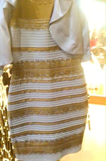
ParticipantListening to the radio this morning, I heard about a picture of a dress that some people see as blue and black while others see as white and gold! Have a look at the photo on the station’s Facebook page.
What do you see?
I see white/gold, with really bad colour balance. My wife sees blue/black, even if I load the photo into Photoshop and reset what I see as white to really white using the eyedropper tool.
At the bottom of a “Yahoo News” article, here:
it says 1.2 million took a poll and 73% see the dress in the photo as white/gold.
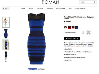
So, how bad is the original photo? Here is a link to the Roman catalogue page:
http://www.romanoriginals.co.uk/invt/70931?colour=Blue
It seems the dress comes in 4 colour combinations. In each case, the lace is black.
February 27, 2015 at 11:06 am #25077picstop
ParticipantI see a photo with tons of noise. In any case, I so see blue(ish) and gold-green-black (likely a result of the noise). I don’t see how 73% see white. I opened the pic into photoshop and the eyedropper on the shoulder reads R:103 G:104 B:134. So whether this is a white dress with really bad colour balance or it really is blue, for all intents and purposes, it’s blue. Unless the poster is messing with people’s minds and switching up the pic because I notice one person first saw white and now blue.
What confuses me most is why you, CC, see white. I don’t want to say I don’t believe you but I also trust my own eyes. On my monitor and my wife’s laptop, we both see blue. By the way, the “original” dress does appear to be a nice cream colour and far from blue.
I don’t know what’s going on here.
On a side note, not to imply anyone has any colour deficiencies, (1 out of us 12 men have some deficiency), it’s always fun to take the Farnsworth Munsell test..http://xritephoto.com/ph_toolframe.aspx?action=coloriq
Lucky me I rank 0. Of course it helps immensely to take the test with a properly set up monitor.February 27, 2015 at 11:38 am #25078Worst Case Scenario
ParticipantWell, there are two of us in my office at the moment, and we both see Blue and black. And like picstop says above the original image is a nice cream colour.
February 27, 2015 at 11:46 am #25079IHF
ParticipantMy daughter had me look last night. I thought it was just happening in her part of the internet world lol I woke up this morning to find out otherwise.
Anyway. I see blue and green. She yelled at me “No! Mom! for real! Look at it! What color is the dress?!” (she sees white and gold) It’s blue and green damn it lol. whelp, I seem to be the only one that sees it this way. I wonder why??? I have optic nerve damage and my eyes are a mess, but I didn’t think it affected the way I see color too much. Regardless, I think we can all agree that it’s a horrible picture, of a very ugly dress no matter the color. and if they had hired a pro to take the picture, none of us would have ever saw it bwahahahahaha
February 27, 2015 at 11:59 am #25080ParticipantTwo things I find interesting are how bad the original photo is, and that some people look at the original photo and still see the original colours, more or less, while others of us see the photo and interpret the colours as though the light was just bad, more so when the choices presented are Blue/Black or White/Gold. The gold is a brassy colour that reminds me of our $1 coin after it has been in use for a while and is dirty, and the white part has a blue tint that you might get from early evening, or shadow.
Even with this photo, my wife says blue/black, most people say white/gold:
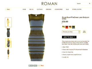
The original web page shows the blue/black dress:
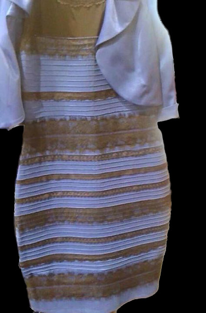
And if you take the web page view above, and use ACR to change the blue to white, this is what you get:
 February 27, 2015 at 12:19 pm #25081Participant
Now I see (“sorta”) white/gold. It’s far from the blue/black online. The two web pages are blue/black and again, something closer to white/gold though still a bit blue.
Most people are not aware that colours can be altered by perception of the surroundings. That’s why we as photographers love photoshop and the gray background. Any colour would influence what we see in our image, inducing our perception to the opposite. A great example is this, http://www.emlii.com/cd000260/These-Gifs-Will-Make-You-Question-Your-Brain-and-Its-Capabilities.It-Couldn%27t-Get-More-Amazing-Than-This See example #9.I can’t believe this has made it to the BBC. http://www.bbc.co.uk/news/blogs-trending-31659395
I wonder how many people would choose green/gold if they were told that was one of the options?February 27, 2015 at 2:16 pm #25082ParticipantOkay. this is weird! I just opened it on my laptop and it’s white and gold, but this morning I saw black and blue. So I assumed it must be a difference in screens. BUT I just asked my daughter and see says it’s STILL blue and black.
February 27, 2015 at 3:40 pm #25083EyeDocPhotog
Participantit’s figure/ground Gestalt visual perception…. kinda.
Like the “candle stick or 2 faces” illusion your brain can only see one thing at a time – you can MAKE yourself see the faces, or the candle stick, but not both together.
Similar thing here. In neurology, you learn that our brains see things as WE THINK THEY ARE SUPPOSED TO BE – for example, a subject seen against sun shining in our eyes (low in the sky) our brains KNOW that a softer, yellowish hue MUST be what we’re supposed to see in the subject, because it’s either morning or evening. However, you can also look at it and NOT PERCEIVE the backlit subject and see it’s true colors, blue/black.
Some people can control how they visually perceive certain phenomenon, others cannot (ie., the old/young lady illusion – many people will just say I see old or young and NEVER appreciate the other).
February 27, 2015 at 3:43 pm #25084Participantby the by, to prove my theory out, if anyone has the time, cut the dress out of the background and place it on a uniform black or white background, and everyone will agree on the image.
I hope. 🙂
February 27, 2015 at 6:35 pm #25085ParticipantI dunno EyeDoc. Like I said, the only white(ish)/gold(ish) I see is in CC’s posted pic. I still see the “original” as blue.
While I always get those “do you see two ducks or two people” sorts of things ( I can even see those 3D images that pop out of abstract 2D images ), my brain still sees blue as blue or at least enough of the tint of the blue that I wouldn’t call it white.
But for sure I do know what you mean about relative colour. Putting a photo somewhere with strong colour will influence your perception of the colours in the photo.February 27, 2015 at 7:09 pm #25086Participantmy point complements your statements from before… visual perception is a very intricate and influenced by many, many factors. Each person has the ability to perceive different things based upon what they see and by what they THINK THEY SEE – this is the point I was making about the photo. It’s shot in morning sun, and for many persons, it tricks your brain into thinking what color shads should look like in this surround.
Again, if you cut the dress out of the bright background and put it against a uniform jet black background, most everyone would agree that the same color prevail.
February 27, 2015 at 9:34 pm #25087jussharp
ParticipantEyeDoc, I’m not sure if the black background changes things too much:
February 27, 2015 at 11:48 pm #25091ParticipantHere it is pasted onto a pure black background. I see blue and gold.
The only time I saw the Tumbler photo as blue and black, the sun was coming in the windows. The rest of the time the same photo was very pale blue and gold, mostly the blue was light enough to be white with a tint caused by shade. I don’t think pasting it onto white or black affects my perception of the dress’ colour.
February 28, 2015 at 7:19 am #25092ParticipantI tried it on the family last night, everyone saw it in the same light and on the same screen. Two saw blue/black, two saw white/ gold? I know very well that putting a strong colour next to paler one, will make you see the opposite strong colour on the paler one. However, the vivid black/blue that I saw were not opposite colour to the white gold?????
February 28, 2015 at 7:31 am #25093ParticipantWell, then I will borrow the words of the fraudster medium (who speaks with the dead) and yells at his audience when he doesn’t receive a hit from a session of cold readings, John Edward: “I’m not getting anything wrong – you’re just refusing to validate what I’m hearing from the other side!!” 🙂
That was my best guess. Another guess would be the interplay of the cone blue/yellow and red/green cone cells when stimulated by certain wavelengths of colors. There are many retinal cells which send signals to the brain based not only upon that they alone are stimulated, but also whether the surrounding cells are either stimulated or NOT stimulated. The relationship between the brain & retina is not and probably never will be fully understood. And sometimes things happen which illustrates this quite elegantly (hence the dress).
-
AuthorPosts
- You must be logged in to reply to this topic.