Home › Forums › Photography Showcase › Photography Website Feedback
- This topic has 28 replies, 9 voices, and was last updated 10 years, 3 months ago by
sshival.
-
AuthorPosts
-
December 13, 2013 at 8:43 am #15721
IainMc
Participant^^^^
Please can you be more specific? The images on the main page or in the archive (which I’ve still to edit)?
December 13, 2013 at 1:52 pm #15727Worst Case Scenario
ParticipantAll of them. They are all pretty meh at best. Sorry I just don’t see anything with any wow factor.
December 13, 2013 at 4:57 pm #15730cameraclicker
ParticipantI think WCS may have a point. I clicked through a number of them fast enough that every few I had to wait for more to load. They seem to have a sameness to them. A lot of them seem to be taken from the same vantage point; I came, I stood, I shot, here’s the photo. Looking at a random photo (/G0000GAvPSYy13hY/15), I have to wonder what it was you wanted me to see. It was cold out, there is early or late light. There are apartment buildings. Some water. Some trees. A few houses. What do you want me to see/think/feel.
Here is one of my photos that people seem to like so I hope WCS will think it has some “wow”:
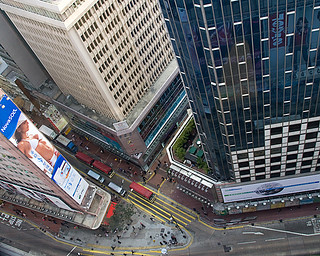
It was taken from the hallway leading to the washrooms at a restaurant called Wa San Mai, in Causeway Bay, HK. I’m sure thousands of photos have been taken of Causeway Bay. I think there are fewer of this view.
I like night photos, or at least I like well done night photos. I looked through yours. This is one I like from those you posted: /G0000ix26I3k7Wto/3. While number 4 is from almost the same spot, it just does not work as well for me.
I think the thing I like about night photos is the clarity, sharpness and burst of colour. A lot of yours seem to be somewhat soft and muted. In the case of 3 & 4 above, 3 has a strong leading line and interesting curve. The light has some vibrancy. 4 on the other hand is mostly headlights and tail lights taken from an overpass.
What we like, may not be what you need if you are shooting for stock. Usually stock purchasers have something in mind and if you have it, you get the sale, if not, then you don’t. Thumbnails that jump off the page may help, but not if the customer is looking for a subdued scene.
December 13, 2013 at 8:25 pm #15736IHF
Participanthttp://500px.com/photo/49010596
http://500px.com/photo/42313162
http://500px.com/photo/49309984
http://500px.com/photo/48181404
http://500px.com/photo/46521808
http://500px.com/photo/47046110
http://500px.com/photo/43536828
http://500px.com/photo/43439420
http://500px.com/photo/38925832
http://500px.com/photo/38853860
http://500px.com/photo/32652183
http://500px.com/photo/21124893
These are just a few Glasgow pictures I found of some of your same subject matter taken more intently and artistically. I got kinda caught up in some portfolios of the architecture that’s available to shoot over there. Gorgeous. Now, Honestly compare the above shots and what you are showing us. Do you now see what we see is lacking? Sure, some need straight up, everyday ho hum stock, but guess what? These days when straight up clean snapping is needed, it’s cheaper and easier for a company to buy a camera and do it themselves, and that’s exactly what they do. I could be way wrong here, it’s not my business to know these things. I’ve only known two companies on a more intimate basis that bought stock regularly, and don’t buy stock anymore. Maybe there are plenty of people dying to get your hands on your stock, but… Critiquing clean no fluff straight up snaps that a decent camera took,seems silly to me. It is what it is, ya know.
December 14, 2013 at 3:09 am #15738nesgran
ParticipantThere’s the occasional better photo in there but most still look like my parents holiday snaps. I don’t think it is impossible for one or two of these to sell but I’d honestly be surprised if the advertising agencies etc couldn’t find a better photo of what they want. The problem is that your photos look like a beginner photographers take on landscape photography with a kit lens. Nothing I’m seeing here suggests to me this was taken with anything better than a entry level m4/3 camera with a kit lens. There’s no dramatic wide angle shots, there’s no clever use of foreground in photos, it seems that the lenses aren’t stopped down enough and used at hyperfocal distance, there’s no long exposure. There’s very little use of leading lines, there are no unexpected or interesting vantage points, there’s loads of clearly legible number plates (clone them out), few of the landscapes look crisp (don’t think this is your website but rather haze in the shots, are you using a polarising filter?), I’m not seeing use of symmetry. Obviously not every shot needs all of these this but most of your shots don’t use any of them. I’ll have to agree with IHF, there is nothing here you couldn’t achieve even if you weren’t interested in photography and your budget for a camera was £250.
December 14, 2013 at 10:19 am #15739ParticipantAny thoughts on my latest shoot (apart from pointing out lens flares on the street lamps in a couple of them)?
http://dunmaglas.photoshelter.com/gallery/2013-12-11-Glasgow/G0000h7CHyH0GiAg/C0000RJnjDQFX1dg
December 14, 2013 at 5:18 pm #15744ParticipantI like the flares from the street lamps. Now that is a much better set and something any numpty with a camera can’t do. Colours are interesting, the long exposures have helped and they look sharp. I’m not too fond of the shots of the streets as they just look like streets late at night in a not particularly interesting place but the shots with the water and the reflections look nice.
December 15, 2013 at 12:33 pm #15763ParticipantMuch better lain 🙂
the colors, lines and comps are really good. I think you still could cut this set down to five or even four though. Maybe it’s just my genre speaking, but it feels repetitive to have so many similar/same shots. Not a fan of the last one at all, if you decide to cull further, that one should be the first to go.
December 17, 2013 at 12:53 pm #15793Sarah
ParticipantI like the look of the website though and it navigates easily. Id change the salmon color of the buy button and title or add it to the main page so that the layout flows nicely.
December 17, 2013 at 12:53 pm #15794Participantsorry about the double post
December 19, 2013 at 2:16 am #15838ebi
Participantyou’ve got way too many images still. I was shocked that you’ve actually edited down even more. One suggestion is that you have too many images in one series. choose the best from each series and go with that. I rally don’t think you need more than 20 per gallery. It’s all mainly architecture and I really think that should be just one gallery alone with say no more than 20-30 images. Beyond that, no one is going to look.
December 19, 2013 at 9:22 am #15840ParticipantOf the last bunch I like http://dunmaglas.photoshelter.com/gallery-image/2013-12-11-Glasgow/G0000h7CHyH0GiAg/I0000mefcdj8LLjs/C0000RJnjDQFX1dg, best.
I’ve been looking at http://dunmaglas.photoshelter.com/gallery-image/2013-12-11-Glasgow/G0000h7CHyH0GiAg/I0000A9oF59hzPYA/C0000RJnjDQFX1dg, for a while. Try cropping it to a panorama. Cut the bottom off from the top of the box in your logo. Cut the top off leaving about 3/4 of a streetlight height above the building venting steam.
It might work even better if you can get a shot of the whole bridge on a windless night with perfectly calm water so the reflections are not distorted. A bus mid-bridge might look better.
December 25, 2013 at 3:02 pm #15921EyeDocPhotog
Participantno doubt you have keen photographic technical skills.
But if I were a potential customer of yours, and navigated to your site from a search engine my first thought would be “What is this site? Photography’s good, but are they offering what I need?”
That’s what not clear…
January 18, 2014 at 12:01 pm #16171sshival
ParticipantCandid wedding photographers in DELHI site
Please review
http://www.thexpressionsphotography.com
http://www.thexpressionsphotography.com/find-wedding-photographer/
-
AuthorPosts
- You must be logged in to reply to this topic.