Home › Forums › Am I a Fauxtog? › Learning, curious to see how I'm doing
- This topic has 21 replies, 5 voices, and was last updated 9 years, 3 months ago by
MrsManiak.
-
AuthorPosts
-
June 7, 2014 at 2:31 pm #19083
MrsManiak
Participanthttps://www.flickr.com/photos/125310041@N02/
I guess I’ll start here. I’m a beginner hobbyist. As in, 6 months in. I have an entry level camera (Nikon D5100), and (mostly) use a 1.8 “nifty fifty”, as I’ve seen it called here. I’m constantly reading photography forums, blogs, tutorials, etc. and I think I’m going about it the right way. I shoot manual, have a grasp of iso/f-stop/shutter speed correlation, and shoot RAW. I haven’t quite gotten the hang of my external flash, but I never ever ever use my pop up. I just want to know how I’m doing. I know I have a long way to go, but it would be nice to get feedback from more than just my photographer friend who is teaching me (I’ve actually helped her grow with the pointers I’ve read, so maybe she just got me started lol). I’ve also bee using photoshop for about 8 years, so I guess I have that going for me in the sense of edits. Please be gentle. Thank you!!
June 7, 2014 at 7:04 pm #19088nesgran
ParticipantYour animal and flower photos are nice but there isn’t that much to say about them to be honest. Everyone and their dog takes photos of their cats and post them on the internet. In general these photos aren’t strong enough in composition/subject/colour/etc to stand on their own. If you created a series of shots it might work as a whole but the one offs, well they don’t add much.
The portraits on the other hand are a different matter. Girl with black furry hood up, this is a great shot slightly ruined sadly. She has a great expression, the composition works well for me but sadly focus is on the furry hood instead of her eyes. This could have been a great shot if it was just a little sharper. I would probably have lightened up her face a little, either with a smidge of fill flash or afterwards in post. A third of a stop would be my suggestion as a starting point.
Same girl but with the brownish wheels. Nowhere near as strong as the hood shot, this looks more like a family holiday photo unfortunately. The water bottle steals attention and you never get a sense of context. What are the brown things? They look like cannons but I’m not sure. It could do with a shorter depth of field as well to draw your eyes to the subject. I think (without knowing what the background looks like) that you could have used a shorter lens, shorter depth of field but included more of the surroundings. The harsh sunlight isn’t great but there aren’t too much of the dreaded raccoon eyes at least.
The shells with rings. Main problem, the horizon. It is not level and it cuts through the rings. Why is there another small shell, does it have a meaning or did it just happen to be there?
The bunny is just freaky
The tea mug concept is nice but I’m sure you could find some better representation of cold and miserable than that?
I think you are doing well for the experience you have and the kit available. Your portraits are more interesting than the rest and I think you have done really with with the first portrait apart from a few problems but I’m sure you’ll learn from them and not repeat them again. I hope you show us where you are at in six months!
June 7, 2014 at 9:21 pm #19090ParticipantThank you for your feedback Nesgran!
The wheels in the portrait (my daughter) were from a cannon, we were at an old fort which has been turned into a museum. I hate to admit this, because I know it’s bad, but I didn’t even notice the water bottle when I snapped the picture. Bad, I know. But, I have been working on trying to look at the whole frame instead of tunnel visioning since then.
The shell with rings is a good example of another issue I’ve been working on: Horizons. I’m not really sure where to place them, and I have noticed that I have overlooked them in many of my photos. I have been trying to pay more attention to making sure they’re straight, but when it comes to placement, I’m at a loss. Would you have placed it above, or below the rings? I think where I went wrong with it in that picture (aside from not being straight), is I was trying to place it above the shell, and completely overlooked the fact that it was on the rings, the whole point of the picture (sigh).
Your comment about the bunny picture made me laugh, because my husband agrees with you 100%. His exact words were “that thing has murder eyes”. That one came from noticing the grass going to seed, and thinking “Ooh I have to take a picture! But what am I gonna put there?” and grabbing my daughter’s beanie baby since it was close to Easter.
The frozen door handle/mirror and tea picture, that’s a complete lack of ideas. Looking back, I could have used better representation. When I got my camera, I decided to learn via project 365, and regretted it after about a week of struggling to figure out what to shoot every day.
I appreciate the feedback, and will definitely work on not repeating my errors in the future. Thank you again!!
June 8, 2014 at 5:16 pm #19098ParticipantI would probably have shot a couple of each variation of rings against sky and sand. Since the rings are silver and the sand is rather pale I would probably have but them so they were in the sky portion as I’d be worried the rings would disappear against the background otherwise. I just noticed you can see the photographer in the top ring which I’d probably edit away.
I could see that bunny with a cleaver in one hand 🙂
June 29, 2014 at 12:50 pm #19716ParticipantOk I’m back for more. I’m not going to keep this picture up for long, because it’s from a wedding I assisted, and I have no idea what kind of contract was signed (not trying to get anyone sued). This is one I took, and I’m only showing the before and after for CC, not trying to sell, etc. So I think I’ll be ok by sharing this, just covering my butt just in case.
Anyway. I know I should have gotten it right in camera first and foremost. But in the meantime, while I learn, I am unfortunately relying on “editing in post”. My question is: if I had gotten the comp right, would this be considered decent?
https://www.flickr.com/photos/125310041@N02/14511996576/
A note on the edit: the left has the crop by the groom’s knee. That is how it was shot. The additional space on the right side of the picture was all fabricated in post, including some of the shingles. REALLY thankful for photoshop experience while I’m learning 🙂
June 29, 2014 at 4:43 pm #19725cameraclicker
ParticipantUsually, activity on the weekend is less than during the week. Your link is not showing a photo.
Composition is only one of many things you have to get right. How was the exposure, pose, expression, background, borders, etc.?
June 29, 2014 at 5:25 pm #19728ParticipantWell, I loved their expressions. They weren’t looking at me intentionally, I was just there for practice and to hold gear, etc. The rest of your question is why I posted the link. It all looks fine to me, but that’s just me. I’m sure every faux thinks their stuff is amazing, so my opinion is somewhat irrelevant in this case 🙂
I fixed the link, I had to step out for a while, so I changed privacy of photo just in case.
June 29, 2014 at 6:39 pm #19730ParticipantCC, if you click the link it’ll show you the shot.
I’m guessing when you got home and opened the photo and saw the shoddy composition you had a bit of a heart sink moment. You’ve sorted it nicely with your photoshop skills but there is something about the perspective that gets my brain a little confused. Don’t worry about getting the shot a bit off, we all have them. I just noticed I have a ladder in the background of some of the posed wedding photos from this weekend. A shiny bloody aluminium ladder just off the brides shoulder partly hidden by some foilage. That’ll be fun to get rid off
They have nice expressions but it looks a little disjointed as they aren’t looking the same direction or at each other. The edit is nice and subtle and makes the photo look a lot better but I think your blacks are a little off as you’ve lightened the shadows making his shirt look washed out.
As for the composition, I would probably have taken the shot from a higher perspective as that way the brides double chins would lessen. All women are self concious about them, even if they don’t say anything. She looks slim apart from that bit and while you don’t want to lie you want to make this appear as flattering as possible.
All in all, I’m guessing you won’t make that mistake again? A good rule of thumb is to always shoot with space to crop.
June 29, 2014 at 7:35 pm #19733ParticipantWhen I opened the photos at home it was definitely a heart sink moment. Thank you for the feedback on the edit, I was worried that it was slightly over the top, and agree his shirt I probably should have masked a bit. Here’s the kicker about the comp, which I will definitely be more vigilant about in the future: I was worried about cropping out their feet, and in making sure I got their feet with enough room to crop, completely spaced the rest. Tunnel vision, I guess.
June 29, 2014 at 8:24 pm #19736ParticipantI see the photos now. I only had a minute before running off to class and wanted to let you know we couldn’t see the link. When I clicked on it, Flickr said “page not found”. And, I wanted to note there was more to a good/bad photo than just composition, but didn’t have time to really get into a long diatribe.
Nesgran’s points are worth noting. It’s amazing what creeps into photos! Space to crop saves work. Frames come in different shapes, 4X6, 5X7, 8X10 are all different height to width ratios, so if you are too tight it can cause difficulty cropping to the various sizes.
I’m wondering if he had a black shirt to start, or a navy blue one. Somehow, it looks a bit purple after editing. I like the edited skin tones better. If you are good with Photoshop, you could adjust the white and black separately from the skin and background then put layers together and mask to get the final result. Way too much work if you are doing 500 photos, but OK for one or two.
I don’t mind they are not looking at the camera. It looks like he has just commented on what he is looking at and she is laughing at the comment. I think it worked well.
All together, I think it is a pretty good photo. You could do some colour correction and some cosmetic adjustment of the bride to improve it further.
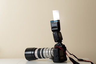
August 24, 2014 at 10:54 am #21681Participanthttps://www.flickr.com/photos/125310041@N02/14832634659/
https://www.flickr.com/photos/125310041@N02/14996817266/
I’m back with questions. These were taken not for composition, but for technical side, so I’m very aware that the background is a hot mess. I was practicing with my speedlite (Yongnuo, I’m not spending $300 for a flash at this point).
Some background as to why I was practicing: My photog friend has recruited me to be a second shooter for a wedding she’s doing in a few weeks. I’m nervous as hell because she’s actually going to pay me. The first one she had me tag along for was a tiny outdoor wedding for about an hour and a half, this one is going to be 7 hours and a mix of indoors and outdoors. I’m going to need to use my flash, and I want to get it right.
So, on to the questions.
Lighting: How was it? First image: I had the flash angled slightly towards the mirror, but mostly straight to the left with the bounce card out. I haven’t seen inside the venue, so I’m not sure what lighting conditions will actually be like until the day of the event. The second image was speedlite pointed directly at ceiling with bounce card deployed as well. I did a color edit on the first one, mainly to see what looked good in that lighting, so I know roughly what I’m going to do for the wedding photos (I’m fairly certain she wants me to edit my own for experience). No color edit on the second image, just slight straightening of image (I’m still working on that, sadly).
Second. Holding my camera. For portrait/vertical orientation, holding it with grip down feels more natural to me, but I’ve found that when I hold it grip up, I have more control over camera angle. Is there a right way, or is it just preference of the person shooting? Am I even doing this right? lol
August 24, 2014 at 12:29 pm #21685Don
ParticipantI’m not spending $300 for a flash at this point
Then you shouldn’t be charging for photos. Photography is ALL about light. If you can’t put money into getting your light properly done, then you shouldn’t be selling your services as a “professional”.
Would you take your broken car to get fixed at a garage that only had hammers?
August 24, 2014 at 12:58 pm #21687ParticipantI’m not selling my services as a professional. I’m assisting my photographer friend who IS. She is well aware of my experience level, and since I’m not charging people and/or doing it as a business, I’m not down for putting business money into it. She’s paying me for assisting her, was her offer, not my demand. Would I let my friend who is learning to be a mechanic work on my car? Possibly not. However, if I did, I would hope he would at least research what he needs to do in order to assist me, which is what I’m doing.
Edited because I think you may have misunderstood what I’m asking: I am well aware that photography is about painting with light, which is why I’m seeking advice on lighting. I’m nervous about assisting my friend since I don’t want my lack of experience to reflect on her, so I’m practicing like a madwoman and actively seeking input on my progress and experiments. I don’t charge for photos, and in no shape way or form call myself a professional (I even refer to myself as a beginner hobbyist in this very thread).
August 24, 2014 at 1:40 pm #21691Participantalso I should note: I posted here to get more feedback/advice other than my friend, since I never know if she is sugar coating feedback since she’s my friend. I figure this is a good place to go for non-partisan input.
August 24, 2014 at 3:48 pm #21694ParticipantI think the light looks pretty reasonable for what you are doing. Sometimes you can angle the light up and behind you, sometimes straight up, or even forward and up if you are shooting someone across a large room. Grip when holding the camera landscape, looks good. Grip when holding the camera portrait, should only be different in that the shutter release hand should be on top, your bottom hand should still be cradling the lens, you seem to have wrapped it around the flash.
Instead of the bounce card, if you are going to point the flash straight up, try rotating the head and wrapping white paper around the back half, like this:
Pay attention to how high the ceiling is, and what colour it is. If you bounce flash off a wall, you need to pay attention to the same things. Try to avoid situations where the camera can see the flash reflected back by mirrors, windows, and high-gloss paint.
-
AuthorPosts
- You must be logged in to reply to this topic.