Home › Forums › Photography Showcase › It's been a long time
- This topic has 8 replies, 5 voices, and was last updated 9 years, 9 months ago by
NoLoveLossless.
-
AuthorPosts
-
July 14, 2014 at 4:50 am #20380
picarusslim
ParticipantMorning/afternoon,
It’s been over a year since i posted here, i’ve now got a ten month old son and a hell of a lot less time on my hands as a result 🙂 . I was only reminded when i saw a ‘model’ shoot of a seemingly grey skinned, quite angry looking lady on facebook, so I thought i’d bob by and reintroduce myself.
I’ve started to pick up a few contacts and for my own enjoyment and to build up a portfolio I’ve started doing a few shoots for models and wannabes (where previously I jut shot landscape, street etc). It’s all going well so far but it’d be great to get an honest opinion of both; the latest shoot (Harriet, Mod style) as well as my photos in general, i appreciate opinions here. I was pleased with the Mod shoot but i rushed it as we were in an area frequented by unpredictable people, so, it was mostly a one light set-up. I generally don’t go for really clean images but I feel i could have made more of an effort to balance shadows and manage the strong sun better.
Can anyone tell me what they think please?
https://www.flickr.com/photos/picarusslim/I couldn’t get the link thing to work, sorry!
Thanks
July 14, 2014 at 4:47 pm #20401cameraclicker
ParticipantThe link “thing” displays a Flickr photo if the link points to a photo that is not protected by having to log into Flickr. Display the link on its own line and it should display a thumbnail here.
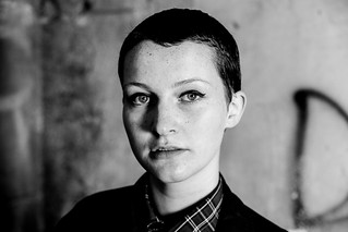
In this one,
you can see the top of her right ear! Her head should be turned ever so slightly more, so the ear disappears but skin at the edge of her face is not broken by the eye. She has a good notch by her eye, so careful turning of her head should work well. Now that it’s shot, you could fix it with Photoshop. It may have been better to get the light up so the shadow of her nose reaches down to touch the corner of her lip.
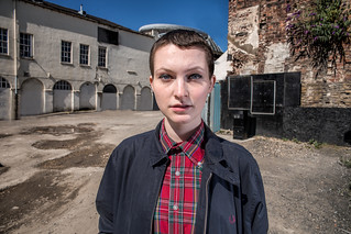
In Harriet and the car park,
I’m not sure why a nice chick like Harriet would frequent a car park. I also don’t know that you did her any favours by shooting square to her chest, or by standing her where that object on the distant roof was starting to become a hat. Can you explain what the unpaved road between a couple of derelict buildings does to aid the photo? Chalk it up to my over-active imagination, but why does she look like a teenage boy who is being photographed by a concealed camera during a drug purchase?
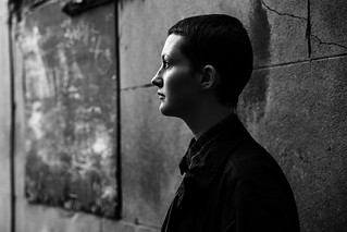
In
androgyny strikes again. I can’t decide if it is the photography or the model. I keep seeing a teenage boy. Ah, well, in this one, the bright spots on that sigh are a distraction. The good news is that you can’t make out any of the words on the sign. There are some spots on her skin that could be cleaned up.
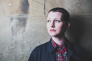
Last one,
seems over exposed. Though, while too bright for the face, her jacket and shirt look pretty good. She is too close to the wall for your camera to blur it much. What is that blob on the wall, someone needed a place to put gum? Once again, her skin could stand a little work.
That last one had 946 views, 78 faves and 2 comments, all of which were more favourable than what I had to say. You have to decide if I’m too cynical or your Flickr friends need to get out more and are just being nice because you stopped by and left nice comments for them.
For those reading along, “last one” is the last of the Harriet set that I’m going to comment on. The Flickr photostream has 1,428 photos, presently. I skipped from the first page to the last and worked backwards a little. This one
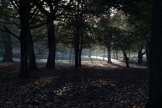
from October 2011, is one I like. I think it has mood and nice light.
All together, the photostream seems to have better portraits earlier, and some good landscapes/cityscapes. With extensive thoughtful pruning it could be a very nice gallery.
July 15, 2014 at 8:56 am #20418picarusslim
ParticipantThanks for that Cameraclicker.
Good points on the ear, and lighting in the first one.
The hat on the second one made me cringe when i noticed. I’d already took several cars and a sign out but missed the top of the round building. The buildings are fully operable, Leeds City just looks a bit derelict 🙂
the over exposed one is pretty shoddy in hindsight, fair enough.
The comments on her looking like a teenage boy are out of line in my opinion, perhaps, like two other people that day, you associate short hair with men and long hair with women, it’s not 1950 😉
Chalk it up to my over-active imagination, but why does she look like a teenage boy who is being photographed by a concealed camera during a drug purchase?
I’ll chalk that up to your over-active imagination! But she is a teenager, so you’re right in part.
I don’t know what happened on Flickr. I don’t really comment much. Faves and views rocketed about two months ago and haven’t stopped. I don’t see the volume of views and faves as an indication of brilliance though 🙂
Thanks for the comments; mostly helpful, the rest smacking of that photographer back handedness that i’ve grown to love. 🙂
July 15, 2014 at 1:43 pm #20423cameraclicker
ParticipantYou’re welcome.
I don’t think it’s the short hair. My wife and a couple of her sisters have short hair. An example of even shorter hair is Sinade O’Connor, when she was younger: http://cdn.mos.musicradar.com/images/features/cover-versions/sinead-o-connor-corbis-630-80.jpg, or http://images6.fanpop.com/image/photos/35200000/Sin-ad-O-Connor-sinead-oconnor-35217109-1000-1001.jpg
I think the short hair removes a visual cue. Her clothing could also be male or female. I think the third thing is your lighting, which is quite hard in all four photos. Fourth, is her poses of which two are square to the camera. Usually women are turned a bit to give them some shape. Petite women are turned a little and rotation is increased along with weight. The first pose is a masculine stance, near shoulder down. The third is profile and the jacket is fairly shapeless.
July 15, 2014 at 4:03 pm #20425emf
ParticipantPetite women are turned a little and rotation is increased along with weight. The first pose is a masculine stance, near shoulder down. The third is profile and the jacket is fairly shapeless.
Cameraclicker, can I ask, can you recommend a good website/ book/resource on such information please. Or is this more learnt over time and experience? I am learning about posing at the moment and all of this is very interesting.
July 15, 2014 at 4:48 pm #20426nesgran
ParticipantI saw a pretty good lecture on youtube by Moshe Zusman, well worth seeing. I think it was a B&H one.
Otherwise there are many a book on the subject, have a browse of Amazon and you can usually see the first few pages to make your mind up whether it looks good or not.
July 15, 2014 at 5:20 pm #20427cameraclicker
ParticipantThe advice always seems to be, visit an art gallery and study the painting of Old Masters. Don’t know how close you are to an art gallery, but it may be a nice way to spend an afternoon.
Here is some video advice, a short one:
Another short one:
Doug Gordon’s promo video has a good lighting point at about 2:36:
And, a long one:
Frank Dispensa seems to be doing this on the fly, but he has good explanations:
Most of it is clear and detailed. He addresses men, women and couples.
July 15, 2014 at 5:43 pm #20429emf
ParticipantThank you Nesgran and CC- they all look very helpful and I will work my way through them.
CC – looking at old masters is a great idea – I am in London will get myself down to the national gallery.
thanks again 🙂
July 16, 2014 at 3:13 pm #20447NoLoveLossless
ParticipantFor posing, this is an excellent video tutorial by Jerry Ghionis via B&H: https://www.youtube.com/watch?v=kmi9TPQ57Mo
I jut love Jerry Ghionis, and as a wedding photographer I seek out every thing he does and soak it up as best as I can. I personally think the man is a genius and a genuinely nice guy.
This is also a good one from him: https://www.youtube.com/watch?v=H2nNxaBA6ss
I’d give anything to attend his workshops – that is on my bucket list. 🙂
-
AuthorPosts
- You must be logged in to reply to this topic.

