Home › Forums › Photography Showcase › Into the Big Middle
- This topic has 14 replies, 5 voices, and was last updated 9 years, 10 months ago by
Trainwreck.
-
AuthorPosts
-
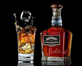
June 6, 2014 at 10:29 am #19055
Trainwreck
ParticipantI can’t take it any longer! No way am I going to sit on the sidelines and let everybody else have all the fun!
My main interest isn’t butchering portraiture, or weddings. I have another genre I enjoy making a complete trainwreck of!
So I’ll just jump right into the Big Middle of this thing with a starter shot!
Please feel free to comment as you see fit. No quarter, no sugar coating. If it gets too bad I have plenty of this stuff left over to kill any pain incurred so let ‘er rip!
I raise my glass to everyone at YANAP!
F/16 @ 1/200th, ISO 800, FL 65mm. 5x studio strobes fired using various modifiers.
On the Rocks…
 June 6, 2014 at 11:47 am #19061
IHF
ParticipantVery nice 🙂 I never had an image of whiskey make me thirsty before lol But, I think I might have to pour a glass of tea after seeing this. The lighting is superb. What are you using as your backdrop/environment? I’m currently looking for some black tile/slate (not sure what to call it) and it looks as though I may have to have it cut for me somewhere that sells and cuts rocks for counter tops, construction and whatnot. My product photography sucks. I wanted to have pictures up of my finished products for people unable to see in person. I want to be able to help them visualize online and give them some sort of perspective as to size 8×10 vs. 20×30 and how the piece will look in their home, but what I ended up with was incredibly bad. I figure I have no right to have a site asking people to invest more into my work, if I can’t even photograph it properly lol I’m working on it though.
June 6, 2014 at 7:34 pm #19067ParticipantThank you I hate Fautography.
If this shot made you thirsty then it must be working!
For this shot I would have chosen one of two surfaces. I like either black plexiglass, or I also use a piece of picture frame glass that I paint (in this case) black on one side (the bottom).
Plexiglass-
Pros- Provides beautiful reflections. No “ghosting” (double reflections). This is very important.
Cons- Rather expensive, scratches easily, collects dust if your set is up for very long.
Glass-
Pros- Cheap. You can paint one side any color. If you need to change color its easy to scrape off the paint with a razor blade scraper and go with another color. Not as easily scratched. Easy to clean. Did I mention cheap?
Cons- Ghosting at some shooting angles. This is unacceptable. Easily broken. Hand easily hacked off when it does!
As I recall for this shot I chose painted glass. The background is a black fleece blanket on a BG stand probably around 7-8 feet away and out of the lighting zones. Cheap and absorbs light pretty well. However, I typically shoot in the studio at max sync speed. In my case 1/200th. This kills all ambient light and I don’t have to stumble around in the dark breaking glass and hacking off limbs! I can leave the lights on with no effect on the shot. So if there is enough room out of the lighting zones behind the scene the BG will go to black anyway regardless.
I have a square of smooth black tile that I really don’t like. I have been unable to find a solid black piece to date. Most I have seen have specks which looks like dust specks in a photo. A piece of textured slate, however, makes a good textured surface to shoot on and doesn’t come off as a bad (dirty) shot.
Good product photography (and I’m not saying this is) takes an insane amount of post production work, a goodly amount of which is just cleaning the product/surface/everything else. And that’s after making sure everything is thoroughly cleaned on-set before pulling the trigger. If you don’t believe that try putting an old gold ring with a gemstone in front of your macro lens and see what you come up with!
So if you feel like it IHF what product(s) are you wanting to shoot and what kind of problems are you experiencing? We might be able to kick around a few ideas if you’ve a mind to.
June 6, 2014 at 9:09 pm #19070cameraclicker
ParticipantThat looks like an excellent drink! I’m impressed the studio strobes stopped the liquid that well. Mine flash too long, so I use Canon Speedlites instead for that sort of thing. Good looking photo!
How much reflection you desire can affect choice of materials. This stuff has less reflection but it is cheap enough and you don’t have to worry about it breaking and cutting you. http://www.homedepot.com/p/Husky-6-ft-x-100-ft-Black-6-mil-Plastic-Sheeting-CF0606B/202184211. If you want a little more reflection, you can place some Saran Wrap over it. Setting it up as a miniature seamless in a shallow pan, you can put a thin film of water over it, which will be reflective once the ripples stop. This works best with items that can stand water.
Black Plexiglas is nice but scratches easily, is stiff, and relatively expensive. Painting glass never occurred to me.
June 6, 2014 at 10:34 pm #19072ParticipantThank you cameraclicker, but I wouldn’t really want to drink this!
It is actually a mix of soy sauce and water matched to the real stuff! I find that whiskey really doesn’t photograph that well! Must be working if it looks good enough to swill!
I have the good stuff stored in the ol’ tried and true Mason Jar! But more importantly? This stuff is $50 a dang bottle! No way I’m splashing that all over the studio! Not to worry though! I’ll be happy to buy you a drink (of the real stuff) someday!
Never tried your plastic sheeting. Interesting though. I’ll give it a shot next time I need a seamless set.
Einsteins in the studio CC. Can’t beat ‘em for short duration. I have some other stuff with even higher velocity drops/splash and these things nail it. Cost about as much if not less than branded speedlights. And they provide enough power for what I do. The only other choice I have found (Broncolor) I’m not about to shell out for! And they don’t provide as short a duration.
It would have been a complete PITA for me to shoot this with speedlights. I can’t zero in where I want my highlights on the glass, liquid, embossing, labels, cap, ice, etc. easily or quickly with them.
Here is 100% from the finished full res .jpg. and downsized again from there. Still looks pretty good even after all that resizing.
June 6, 2014 at 11:13 pm #19077ParticipantThe shinny black surfaces are more for me to play around with and make pretty stuff look prettier. Thank you so much for the ideas :). I’ll figure something out because I have ideas in my head that I can’t follow through with without it. It’s driving me nuts.
I thought a lot about my stupid product shots today, and I came to the conclusion, that I’m just sloppy and lazy.
I think what really goes wrong when I try to shoot my finished work, and different mountings I want to sell, is that I don’t treat it well. I don’t think of it as photography like I should. I take short cuts and I’m sloppy with it because I’m not into it. Example: I use auto WB instead of setting it properly. Use my hand to hold products instead of properly securing them/propping them/posing them. I use aperture priority instead of fiddling, and I don’t take too much care with lighting. I also didn’t stage well for any of my wall shots. I think if I really take my time and take it more seriously I’ll be much happier with the results. I really shouldn’t procrastinate any longer, suck it up and get it done. Who knows? I might even end up enjoying it. There IS an art to it for sure and I was wrong to think otherwise.June 7, 2014 at 6:12 pm #19084nesgran
ParticipantIt looks great, it is of a quality you’d see in a magazine somewhere.
If I were to make nitpicks though the glass appears to be leaning towards the centre, the sunstar in the collar of the bottle is a little bit distracting and the ice cubes look too big for the glass. Like I said, nitpicks.
Could you not have gotten away with lower ISO?
June 7, 2014 at 7:59 pm #19089ParticipantHi nesgran!
Thank you for taking the time to view and comment. It is appreciated.
As regards the ISO value? When shooting motion (splash) I push the ISO in order to keep to minimum Ws on the strobes, which keeps the t.1 to minimum, which stops the motion. ISO 800 is not a biggie at all!
The glass grids out pretty much on the $$. I see what you mean though. What would you suggest?
June 7, 2014 at 10:28 pm #19091ParticipantNow that you have me obsessing nesgran I believe you are absolutely right about that glass!
The glass appeared level on the bottom but the sides tell a different story.
A quickie correction on the .jpg (the .psd is archived at the moment) and a before and after. I didn’t reach exact perfection but you can sure tell a difference!
Great to have a fresh pair of eyes on it. I appreciate that nesgran. Good call!
June 8, 2014 at 3:38 pm #19095Worst Case Scenario
ParticipantNicely done!
I did wonder why the liquid in the bottle is a different colour to the glass?
Only a nit picking photographer would notice that the ice isn’t floating, ie not real!
I love shooting products, I used to shoot stuff like this on 5×4 trannys. Sadly there’s hardly any of this work about this days : (June 8, 2014 at 4:26 pm #19096ParticipantAnd here I was, under the impression the cube at the bottom of the glass was what caused the splash, and had not had a chance to float, since the second cube is still falling.
I would give the colour a pass as well since the bottle is at least as thick as the glass, and the bottle’s liquid is undisturbed, but there is a lot of air mixed into the glass’ liquid because the ice has just hit the bottom of the glass. I would be thinking “Fake!” if they were the same colour.
June 8, 2014 at 5:01 pm #19097ParticipantDid you shoot this in one shot? Did you never consider doing a simple composite of it since you have two elements away from each other which would have given you more pixels on the finished product and also probably given you an easier time lighting it?
I figured you were running your strobes on low for the stopping capabilities but I was still a little surprised about iso 800
June 8, 2014 at 7:52 pm #19107ParticipantHope everyone had a good weekend!
Thank you for commenting Worst Case.
The liquid in the glass is the same color as the liquid in the bottle. It was matched before the shoot. As cameraclicker mentioned the liquid looks different because it is being displaced by the cube at the bottom of the glass, which did indeed cause the splash. There are spots of the liquid that actually do match. The differing colors are simply being caused by the back lighting in the liquid.
The scene is backlit (among a lot of other lighting) for separation purposes and also to give the liquid its glow. Otherwise the liquid would look unacceptably dark! There is a small reflector/diffuser, just smaller than the glass, with some slots cut in it behind the glass. The slots are to let some of the negative light of the black BG to come through in the liquid and the solid glass base of the glass. Without this the base of the glass would photograph as solid black. As an example you can see a solid black piece in the base of the glass. This corresponds to a slot in the reflector/diffuser behind the glass. To portray a glossy surface the gamut needs to run from solid black in areas to solid white in areas and tones in between. Otherwise it photographs as matte. There is also a reflector behind the bottle with no holes cut for a more even backlighting effect.
nesgran, I like to get as much as I can in one shot but this is a composite. It’s the only way really unless you want to clean up the set everytime between splashes until you get what you want. And I never get what I want the first time! And you can’t move things around once you get the lighting set. It is very precise and sometimes the lighting can change drastically with just a small movement of either the subject or light. But I certainly want as few shots as possible if compositing.
I don’t use a DoF calculator (admittedly I probably should!). Shot fairly well stopped down (f/16) needed the ISO value. I might have gotten away with opening up a bit but certainly everything in the shot needed to be in good focus. I didn’t fiddle with the settings too much as long as I could get the DoF/light/duration I needed and f/16 was an arbitrary decision. I always shoot tethered in the studio and just eye-ball the DoF! I don’t consider ISO 800 a big deal at all for this kind of work although its probably unheard of in studio portraiture I suppose.
June 9, 2014 at 10:09 am #19114ParticipantOnly a nit picking photographer would notice that the ice isn’t floating, ie not real!
Not meant as a criticism, just after years working in studio, non floating ice is the first thing I notice on any drinks ad. And the colour was just something I was “wondering” about. The glass looks more of a whiskey colour, so I’d probably alter the bottle in post. Still a great shot though.
June 9, 2014 at 10:17 am #19115ParticipantYou are of course right Worst Case!
The ice is acrylic props. No ice I can make looks that perfect and these cubes are great to work with. And I’ve tried! They do make floaters but the particular cube in question just dropped into the bottom of the glass to make the splash.
No worries about criticism! I am open to it and welcome any help I can get. Especially from a seasoned pro such as yourself. Which is why I post. Sometimes I figure a word of explanation may help to clarify so that critiques may be more targeted. Usually I am wrong but it doesn’t seem to stop me!
I just want you to know I appreciate you taking the time to comment. Thank you.
-
AuthorPosts
- You must be logged in to reply to this topic.