Home › Forums › Photography Showcase › Does the color look OK in these to you? Critique welcome.
- This topic has 4 replies, 3 voices, and was last updated 9 years, 8 months ago by
cameraclicker.
-
AuthorPosts
-
August 2, 2014 at 7:21 pm #20841
alisamer
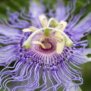
ParticipantI’ve noticed that on my new laptop my images look fantastic to me color/contrast-wise, but then when I view the same ones on my phone they are more muted and lean more toward blue than I’d intended. I’m going to check these on my good calibrated monitor at work on Monday, but figured I’d ask here as well – anyone willing to take a look? Some of these are fine, but the flower ones from today look especially disappointing on my phone, which prompted me to post.
Critique is also welcome, I’m definitely an amateur and still learning.
Links: https://flic.kr/p/oyUVHm

If you happen to look further through my Flickr, everything from July 4 on was processed on this laptop, previous shots are done with other computers. Also, my Flickr is not a portfolio, more a gallery for sharing so there are some things in there (the recent convention photos, especially) that I know are pretty bad.
Thank you!
August 2, 2014 at 8:52 pm #20842cameraclicker
ParticipantSometimes I lose track, and this is one of those times. I don’t remember if we talked about colour spaces here or it was all on other sites. Anyway, opening your second photo in Flickr, and scrolling down the EXIF data, eventually we see:
Color Mode – RGB
ICCProfile Name – Adobe RGB (1998)If I view one of the files I posted on Flickr, and scroll through the EXIF data I see:
Color Mode – RGB
ICCProfile Name – sRGB IEC61966-2.1So, what’s the difference? Adobe RGB(1998) is a bigger colour space than sRGB IEC61966-2.1. You might think a bigger colour space would be better, but sometimes it’s not. The thing is, JPEG colour is made up of 3 bytes, so you have 0-255, or 256 values for a red channel, a green channel and a blue channel (RGB). Now, the numbers are just numbers, until you tell your program how to interpret them, and the ICC Profile is what tells your program what the numbers mean.
The other thing you need to know is that while some software can locate the profile name in the JPEG file, and has that profile table available to use, other programs don’t. And most of the programs that don’t will use sRGB, regardless of the name stored in the JPEG file.
So, what happens is that one program displays this really great looking image because it knows what the Adobe RGB numbers are supposed to look like, and another program applies the sRGB table, and displays the file incorrectly. The effect is that the incorrectly displayed file looks less vibrant. This is probably what your phone is doing to you.
There are several good web pages that discuss colour gamuts and profiles in detail. Thinking about that, I’m pretty sure a recent thread had links to a couple of them. Anyhow, the above is the 5 cent, layman’s version of what is going on, and if you really want to get into the details, we can provide the links again.
Most of the time, I shoot to raw files. The raw converters are set up to pass the files into Photoshop using the ProPhoto RGB profile (a much larger colour space than either sRGB or Adobe RGB), which is used for editing and printing locally. I got tired of doing the same few steps over and over when preparing files for Flickr, my own web pages, and/or off-site printing, so I recorded actions that do the last few steps. The actions flatten layers, apply unsharp mask, convert the profile to sRGB, convert the file to 8 bits, save the file in the right folder, and close the image in Photoshop. One click instead of eight, but if you are doing 500 files at a time, it adds up.
August 3, 2014 at 8:49 am #20851EyeDocPhotog
ParticipantThis article is a nice complement to CC’s comments as it adds visuals. http://cameradojo.com/adobe-rgb-vs-srgb-vs-prophoto-rgb/
That being said, my own personal preference is that I don’t really care about colour space if I’m posting to the web. There is a plethora of monitor and browser settings and no 2 people are likely to have their settings the same. Think when you go into an electronics store and see all the TVs lined up on the same channel – every picture looks SLIGHTLY different in colour, luminance, white balance & contrast among others. Any ONE of the monitors would be fine be itself, but when you look at the comparisons, you get lost in the forest. Because of this, my ‘portfolio’ is in book form so the few clients who would be interested in my work can see it THE WAY I WANT THEM TO SEE IT.
Color space DOES matter, of course, when I am sending my work to Blurb for books or BayPhoto for very large prints (over 24″ x 36″). I use an x-rite ColorMunki Photo system to calibrate everything properly so I have no surprises. What I see is what I get. Period.
August 3, 2014 at 1:42 pm #20854ParticipantThank you both very much! Clearly I need to learn more about RGB color spaces, so that’s my next assignment for myself. My main worry was that this new (well, new to me) laptop might have some color representation issues, but I do realize every monitor is different, sometimes very different.
I’m a graphic designer, but I work in print only… so I can usually tell at a glance what needs to be done to a photo for printing on our equipment at work – but that means I work and think exclusively in CMYK. In fact, when I looked at these photos on my phone, my first thought was “Wow, I need to pull back the cyan and black in the midtones there!” I know the basics of how RGB is different, but otherwise it’s just me telling my customers “If you send us RGB files, the color will shift, because we don’t use that. And don’t use RGB black for anything, because it isn’t black!” I have on occasion converted a photo that needed heavy color correction over to CMYK to work on it, then converted back to RGB for web posting, because it’s easy for me to go into CMYK curves and adjust it well, while RGB works so differently I struggle with it. Some vibrance and a good bit of color range is lost in the conversion, but at least I could figure out how to help it.
I have just recently (since I got this new laptop) switched to shooting in Raw only, which has really made a huge difference in my photos. I’m converting using Photoshop’s camera raw, but my other next assignment is to teach myself Lightroom. I have it, I just need to learn it. I’m loving being able to get a photo just right before taking it into Photoshop, then I usually just have to do a quick levels check there and save it out.
So thanks again, I’m off to read up on RGB color spaces.
August 3, 2014 at 4:00 pm #20857ParticipantLike the doctor, I use an x-rite ColorMunki Photo system to calibrate both monitor and printer. It definitely helps achieve a print that looks as expected. The doctor is also correct that everyone without a calibrated monitor, and the right room lighting, will see your image differently than you did. If you are not converting the image to sRGB, you are compounding the problem for those without the right browser.
I don’t know if this will help. You probably already know, the ink on a print, and CMYK is subtractive, while transparencies, monitors and RGB is additive. Or, adding coloured ink to paper removes from white, adding coloured light on your monitor will bring it toward white. Moving back and forth between gamuts is a problem because some shades are forced to different shades when moving from a larger space to a smaller one. Converting the other way, you can’t really reverse the process.
They look a little different, but the version of Adobe Camera Raw in Lightroom is supposed to be equivalent to the version in Photoshop. Instead of Lightroom, I use Bridge to locate and open raw files in ACR. Then once the initial adjustments are made, it goes to Photoshop. I don’t bother with Lightroom at all.
-
AuthorPosts
- You must be logged in to reply to this topic.