Home › Forums › Photography Showcase › Critique please
- This topic has 17 replies, 7 voices, and was last updated 10 years, 8 months ago by
Brownie.
-
AuthorPosts
-
March 25, 2013 at 2:08 pm #8206
lce
ParticipantHi everyone! I’ve been shooting for roughly three months now, I received a DSLR as a gift this past Christmas. It was originally intended for taking photo references for portrait drawings, and taking photos of my kids. I soon became intrigued, then OBSESSED with photography. Because I have a background in fine art (drawing and painting), I know that one of the best ways to learn and grow is through critiques and advice by other artists. I would be so grateful if you’d take some time and critique my work. Thank you! <a href=” http://www.flickr.com/photos/lceymil/”>My Flickr</a>
March 25, 2013 at 2:10 pm #8207Participantso, that link was a fail.. http://www.flickr.com/photos/lceymil/
March 26, 2013 at 1:13 pm #8226fstopper89
ParticipantWith the few images you have, it looks like you’re on the right track. They have nice, sharp focus, are largely composed well, and your exposure looks very good. You seem to know your post-processing techniques pretty well too. Having an art background really does help. Just keep shooting!
March 26, 2013 at 4:33 pm #8230ParticipantThank you! I appreciate the encouraging feedback :).
March 26, 2013 at 9:20 pm #8251Thomas
ParticipantAgreed.
http://www.flickr.com/photos/lceymil/8580156313/in/photostream – Great
http://www.flickr.com/photos/lceymil/8580189777/in/photostream – Great
http://www.flickr.com/photos/lceymil/8580130783/in/photostream – Not sure why I like it but I do. I have to say something about this though, it’s not a criticism, just an observation. The line of the furniture (slant) in the background annoys me. And I mean this about ALL photos like that. What frustrates me is that sometimes, even when I straighten my shots and I know they are straight, the other lines or perspectives in the image bug the hell out of me when they make it look wonky. It’s worse on wide angle shots as it’s impossible to correct for every line. I’m going to borrow your image and straighten it anti clockwise a bit and see if I’m still as annoyed….LOL.Seriously it’s not a criticism, it happens in LOADS of photos I’ve seen.
Ok so I did it, it still pissed me off. It wasn’t so much the furniture but that thing that comes in from top left and slope down towards middle right…stupid perspective. Anyways, good work, keep it going!
March 27, 2013 at 12:13 am #8256ParticipantI see what you mean with the third photo, and now it’s bugging me too…
Thank you for the praise and encouragement!
August 8, 2013 at 4:14 pm #11759emf
ParticipantI know this thread is old but I’ve just stumbled across it and gotta say I really like your photos! I’m a noob (same as you actually, fine art background 🙂 ) But I love the way you capture something very real about childhood, your images seem to cut through the cutesy cliches of child portraiture and capture some of the magic and sometimes strange little worlds that kids tend to inhabit. This is really interesting for me as it’s the kind of thing I’m interested in at the moment. It makes me think of the work of Eli Reed or Sally Mann.
This is great!
August 8, 2013 at 5:46 pm #11761cameraclicker
ParticipantBright background objects can be a pain! If you tilt the camera, cubes change shape and lines converge. If you don’t need it to show reality, you can change it. How’s this?
August 9, 2013 at 1:29 am #11772ebi
ParticipantFinally, someone who has the common decency to edit better.
Love these two: http://www.flickr.com/photos/lceymil/8595285011/in/set-72157633064585794
But other than that it’s just a lot of snapshots. But snapshots aren’t really a bad thing. I really like what this guy does: http://www.galharpaz.com/theo-roids and he actually shoots polaroid film so you can get a feel for what it looks like in different lighting situations since you seem to like that vintage-y feel.
Let the shadows go a little more dark. They are unnaturally open too much. I prefer the b&w over the color stuff as well.
August 15, 2013 at 2:49 pm #11941Brownie
ParticipantYou’ll have to forgive me bumping an old post but I had to comment.
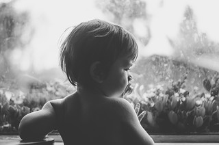
I find most of your monochrome images to be quite strong and I can definitely see your influence from other mediums leaking in. You understand how light contours surface well and it shows in the successful photographs. Your subjects are naturally expressive without the appearance of being posed or manipulated into positions they wouldn’t be in normally. These images have a pulse, the window lit one is alive and timeless. It’s a very strong image of a child, and I can’t think of a time where I have said that about someone’s work on here.
And I’m not sure I feel about the shadows, I feel like if they go much darker, it may ruin the delicateness of the images. You’ll have to experiment.
I find the color work to be predictable and pose-y. Just visual identification of the child. I think they have a bit too much contrast. They are definitely bright images, I find myself squinting a bit when I look at them.
although, this image: http://www.flickr.com/photos/lceymil/8580192065/, grossed me out the first time I saw it, and I like that about it. It connected with me. Now, I’m thinking about the pain of the teeth, how red those gums are and how uncomfortable this child looks. I think it transfers pretty convincingly.
Continue to push it. Consider ways to make more images that transcend just your child and can be translated to all children, childhood, things like that…
August 15, 2013 at 2:59 pm #11942ParticipantI have to say, I think this is a great critique!
August 17, 2013 at 12:30 am #11998ParticipantCheers! Thank you.
August 22, 2013 at 1:52 pm #12193ParticipantWow, I’ve been away for a while, but I’m glad I decided to check up on this thread!
Emf – thank you! It really helps to have an art background. I need to update my Flickr, I’ve taken 193857929 photos since then and I’d love your input.
Cameraclicker- thanks for the tip :). And I love your play. I appreciate you taking the time.
ebi- thank you for the critique. I also prefer bw, it’s so fun got play with light and shadow. My color editing has changed since those photos – I now prefer a very clean edit with a slight vintage feel. I agree that the color ones are too bright / saturated.
Brownie – great crit! I like to capture candid moments of my children. When they appear to be deep in thought, the little details of their babyhood that I want to hold on to. the editing of the color photos was to appeal to the public, it was the trend and they seemed to prefer it to my “darker” personal work. I eventually stopped giving a shit and decided to make art that I’m proud of. Thanks again, I’ll continue to challenge myself
August 22, 2013 at 2:03 pm #12195ParticipantIce – please don’t upload all 183857929 of them!!!!
August 22, 2013 at 2:06 pm #12197ParticipantEbi- oh, it’s happening. Get ready
-
AuthorPosts
- You must be logged in to reply to this topic.