Home › Forums › Am I a Fauxtog? › Critique my work please?
- This topic has 22 replies, 18 voices, and was last updated 9 years, 1 month ago by
Sharra.
-
AuthorPosts
-
January 4, 2015 at 12:28 am #23599
abobeck11
ParticipantI am a 16 year old photographer completely self taught. Can someone tell me how I’m doing? Website is http://www.aaronbobeckphotography.com, portfolio is on my homepage. You can also look at my other galleries on there if you want.
January 4, 2015 at 9:30 am #23600MrsManiak
ParticipantHi Abobeck!
First off, I’m still learning myself, so my critiques won’t be as thorough as anyone else’s.
http://www.aaronbobeckphotography.com/Portfolio/i-284hStq
The spot color. It draws your eyes to what is colored, and away from your subject. It’s tacky and overused (and usually screams faux). From what I understand though, if the client wants it, you do what they’re paying you for.. just don’t add it to your portfolio. That being said, when you do it, zoom all the way in and make sure you don’t miss a spot or color something that’s not supposed to be colored. You missed a part of the ball, and colored his fingers a bit.
http://www.aaronbobeckphotography.com/Portfolio/i-QQvzK79
I love this one, especially the framing. The girl on the left has a hot spot on her cheek, and honestly I don’t know how much of an issue that is in the professional world. If you had moved to the left and had them turn to face you (putting the sun more behind them and less from the side) I’m pretty sure that would have eliminated it.
http://www.aaronbobeckphotography.com/Portfolio/i-TFnF7dH
This one, I like it, but the edit is too bold for me. You missed a spot in the bottom right of the picture, the leaves are still green. When masking the left pillar, you also masked part of the gate and a few leaves. I’m not sure exactly what you used to change the colors, but I’ve done the same thing before by using a selective color adjustment layer in photoshop and playing around (http://i.imgur.com/EQnCjuf.jpg?1). That goes with the first critique though, make sure when you’re masking, zoom all the way in and use a smaller brush size to make sure you’re only masking what you intend to.
HDR isn’t really my style so I have nothing to add about those. Personally I don’t see you as a faux and I like a lot of your images.
Edit: I almost forgot, the white balance is slightly off on a few of them. You can do a few things to help you get proper WB when shooting. Some cameras will let you set kelvin temps, but if yours doesn’t, you can set it when you open the RAW file. https://fstoppers.com/post-production/learn-shoot-proper-white-balance-using-kelvin-temps-3328 I used that OR the “coffee filter over the lens” method to set WB before I got an expodisc.
January 4, 2015 at 9:48 am #23602cameraclicker
ParticipantIs
http://www.aaronbobeckphotography.com/Portfolio/i-d5sNW54
the view from the Niagara Falls Observation Tower
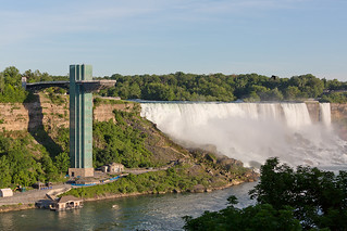
?
It looks like you have tried some different styles and processing techniques. I like the gallery.
January 4, 2015 at 7:45 pm #23606Don
ParticipantOver processed. Too much HDR. Stop it with the watermarks. No one is going to steal your photos.
January 4, 2015 at 7:52 pm #23607ParticipantNone of this work is HDR.
January 5, 2015 at 7:28 am #23614EyeDocPhotog
ParticipantI like them. You’ve got a good eye.
The only only I think that’s not the greatest is the selective color (child holding the ball). That’s just my personal preference, though. You (or the client) may like it and that’s just fine.
January 7, 2015 at 6:24 am #23626Worst Case Scenario
ParticipantI’ve been running a studio and making a living as a photographer for the last 35 years, so some may think my opinion is worth having…………
Seriously dude! 16!!!!!!!!! I’m gobsmacked by your work!
There’s never been a picture taken that you can’t pull apart critics after and yours are just the same, but overall your great pics far out weigh the bad. Looking at you home page, I see 4 shots that aren’t up to par. I haven’t counted the total on the page, it looks like about 60? So 4 that aren’t as good as the others is nothing to worry about.
Knowing that you were 16 before clicking the link, left me a bit uneasy when I saw how professional your page looked. I sort of felt that a 16 year old setting up a business was a bad thing, almost like you were conning your customers? But when I looked at your work, I started thinking ” Well why not?” There’s plenty of fauxs out there who really are conning the public, so a 16 year old who knows what he’s doing is good.
I’d like to help you get even better, I’m in the UK so you’re far enough away to not be competition! Just ask……..
January 7, 2015 at 7:30 am #23629nesgran
ParticipantI’ll agree with WCS, well done.
There are obviously some problems. Your colours seem all over the place with several that have a clear green hue. Are you using a colour calibrated monitor? If not this should be your first investment
Secondly, I would split the gallery between the cityscape type shots and the portraits. Imagine being a person out shopping for a photographer to shoot their kids bar mitzva/tenth birthday party/corporate event etc. Would they really want to sift through all those photos looking for examples of portraits?
Thirdly, the white vignettes should go. That is all have I to say on that topic
Keep it up but make sure you take on assisting jobs to learn more about the important bits about being a photographer, i.e. not the actual taking of photos. That is only a minor part of the key to running a successful business. Unless you are incredibly business savvy prepare to run in to problems and that fast. Oh, and pay your taxes and insurance.
January 7, 2015 at 12:29 pm #23633emf
ParticipantI agree, for only 16 I think you’re doing great – keep learning!
January 7, 2015 at 6:20 pm #23639Dudley
ParticipantOkay let me get this straight. Sixteen years old, a respectable portfolio of nearly every genre and landscapes from around the world. A very rich genius? Maybe legit, if so, very unique. But for now I’m needing some more info I think.
January 8, 2015 at 9:38 pm #23668jussharp
ParticipantI love how you say in your bio that you had a passion for photography since you were “a young kid.” 🙂 You STILL are a young kid. Just kidding. You have some great shots! Keep shooting and eventually find your one cohesive voice. Most pros find their genre (portrait, landscape, etc) and they develop their style where no matter the photo, you can tell that one individual took that photo. You are on your way.
January 8, 2015 at 11:24 pm #23671BigRed
ParticipantFantastic stuff especially for a 16 year old.
No one mentioned your sports yet (which is my favorite) so I’ll go there, specifically the football.
With sports, it’s simple – it’s about showing your subject, the players. This means you should be cropping the hell out of them. You need to fill the frame with your subject.
http://www.aaronbobeckphotography.com/School/Homecoming-Football-October-18-2/i-sqJMCLR/A
In that light, I would crop something like this to just the player, as a portrait. The field is just dead space.
This is good, but it just needs a better crop. As the photographer, I show people what I want them to see. I don’t want them to see the ref’s shirt.
http://www.aaronbobeckphotography.com/School/Homecoming-Football-October-18-2/i-p9FbHfn/A
That also brings me to faces. You need to be able to see faces. You wouldn’t shoot someone’s senior photos without showing their faces. There’s really little value to something like this.
http://www.aaronbobeckphotography.com/School/Homecoming-Football-October-18-2/i-VmpWVp2/A
Same thing. I also don’t care what actually happened here, whether it was a safety or a touchdown. The viewer can’t understand what’s going on.
http://www.aaronbobeckphotography.com/School/Homecoming-Football-October-18-2/i-WSdbJNB/A
Football has this tendency to just become a large pile of guys, really after every play. Avoid shots like these. It’s impossible to understand what’s actually going on, who has the ball, and you can’t see faces. There’s really no one who wants these photos. Anticipating the next play and understanding the game is probably the most important part of getting the perfect shot. If you don’t anticipate it correctly, you’ll end up with a lot like these.
I never liked the shooting for volume thing. Sometimes photogs like yourself may need to do that so parents looking to purchase their child’s photos can find the perfect one. As a photojournalist, that kills me. I hate duplicates and shots of the same play (usually). I ultimately will come up with an album of ten very different photos that tell the story of the whole game. Even for what you do, I would still show people my best shots, but that’s just me. If you want to make a sports portfolio, I would definitely consider cutting down on the similar or uninteresting images, which would including boring ones of people standing around and not showing emotion.
Dutch angles are nauseating and should be used almost never. Not really necessary in HS sports..
http://www.aaronbobeckphotography.com/School/Homecoming-Football-October-18-2/i-XFMpcGD/A
but definitely necessary for the Penn State BOT..
http://www4.pictures.zimbio.com/gi/John+Surma+Penn+State+Board+Trustees+Press+FpgTampawCFl.jpg
I also saw a volleyball album. With volleyball, try to shoot from different angles, especially behind the ends. It will keep your backgrounds cleaner and you’ll get good action on the net.
In closing for football, I would recommend shooting from the end zones whenever possible to keep the backgrounds clean and not miss touchdowns, and make sure your photos are in focus. I may have seen a few with unwanted motion blur or a missed focus here or there. 1/500 will stop action.
Feel free to not take any of this advice too, I just like looking at sports albums!
January 9, 2015 at 11:19 am #23689CPowers
ParticipantI’ll echo much of the same sentiments others have said… Very nice work for anyone, regardless of age and experience. As stated before, any photo can be picked apart to some degree. You’ve got a couple on there that don’t quite reach the mark of the bulk of your offering but they’re few. You obviously have a better grasp of how to use color, light and detail better than most, especially this early in your career. All those watermarks are a bit distracting especially on your own site. I have to say, in general you have created some really nice work so far.
January 9, 2015 at 12:03 pm #23691IHF
ParticipantAbobeck,
I had came and had a look when you first posted. Had some criticism and compliments, and I didn’t know quite how to word myself. When I tried it came out wrong. So I sat on it, came back a few times to try to articulate… Then, to be honest.. I forgot all about it until I peeked on YANAP today.
I noticed you simplified your page/port a little, and oh my what a difference that made. A good difference. Your photography shows much better than it did when you first posted, and my mixed up feelings and photography OCD subsided a little.
There are only a few things about your port that give away that you are a beginner. They’ve all been pointed out, and that consistency that only comes with time isn’t there, but it’s obvious you are honing in. But, now IS the time for experimentation and inconsistency. Finding your thing and changing and evolving etc so really, just keep keepin on, can’t speed up time, and there’s no race to win anyway.
My first impression was “My goodness! This kid is someone to watch. I can see him making some wonderful pictures during his life”. You’re going to kick my ass that’s for sure (if you aren’t already) As long as you stay on track, keep moving forward, and don’t fall into traps, or let this fabulous critique you have received on this thread go to your head 😉
I think you might like, and get a lot from Kelby’s blind critiques, if you haven’t checked them out already. Especially when they cover landscape photography. Their special guests are always great too. And if by off chance you came here for more negative feedback on your images (I hope you don’t think I’m crazy, and I’m reading you right, but harsh, honest, negative feedback is hard to find out there), do a google search for “the shark tank”, it’s a forum that only allows negative feedback, and you might get quite a lot from posting a few shots there.January 15, 2015 at 2:14 am #23954Bill
ParticipantGreat job for being self taught and especially at your age.
No you have a nice portfolio that shows that you are versatile, but you definitely need to show less in your portfolio, hear me out.
I your portraits section of the various families, I would taylor down the amount of photos shown, unless you are doing it for the sake of the client. The ones I would ditch are the repeats of the same photo but done in different styles, like the same photo in B&W. Pick one and delete the other. In one family I counted at least a dozen photos, 6 in color and 6 in B&W that were basically the same photo, but slightly different. In your case with portraits, less is more.
The landscapes I like the colors, though there are some that vary from very vivid on the right to drab on the left.
Some of your landscapes do cry out that they are over-processed like Don pointed out, I believe that some are composites, but I could be wrong. The skies have much more noise in them then the foreground and other features in the landscapes. I see this a lot when people over-use NIK color FX in either Tone mapping or the detail extractor. If it works, then fine, but yours has a bunch of noise and some artifacts in them that needs to be addressed. Try running DeFine or Noiseware to help reduce the graininess in your night skies, it may help.
I like your work, it’s good and you show great promise. It’s not flawless, but then again, whose work isn’t. Keep up the good work and try to better hone your editing skills.
-
AuthorPosts
- You must be logged in to reply to this topic.