Home › Forums › Photography Showcase › Back for more input
- This topic has 4 replies, 3 voices, and was last updated 10 years, 5 months ago by
adent.
-
AuthorPosts
-
November 9, 2013 at 8:25 pm #15037
adent
ParticipantA few months back (about 5) I posted my flickr link on here and got some good feedback and advice. I’ve since up loaded some newer shots and would like some more opinions/advice. I’ve mostly been doing local band performances.
November 11, 2013 at 6:57 am #15117cameraclicker
ParticipantAs a general comment, I’m somewhat conflicted. When doing critiques, I like to see a larger image, or at least a large enough image that I can see if something is really in focus or not. At the same time, when I am posting photos from an event, I may be putting up two or three hundred photos for a group to see and I doubt anyone in the group will look at anything outside the slide show, or next in stream, size. On my own web pages, most large images are 1024 px wide and the small size is 800 px wide to accommodate smaller screens. The forums based on the Ning template usually display about 640 px wide and if your photos are larger they are resized, which affects their appearance. The first two of yours that I chose to examine both look much better at the largest size available than they do at the default display size. It’s important to know your audience and understand the platform’s characteristics.
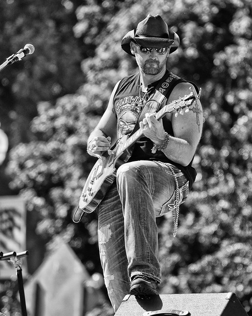
He is sharp, so are all the little bokeh balls. It’s less obvious in the larger image. Try reducung sharpness of the background.
This is in the group to attract the vampires among us?

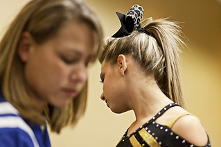
Her hair (bangs) is in focus, eyes look softer, cheek looks strange. It looks much better in the large version. This needs a little more DOF.
November 11, 2013 at 7:13 am #15118Worst Case Scenario
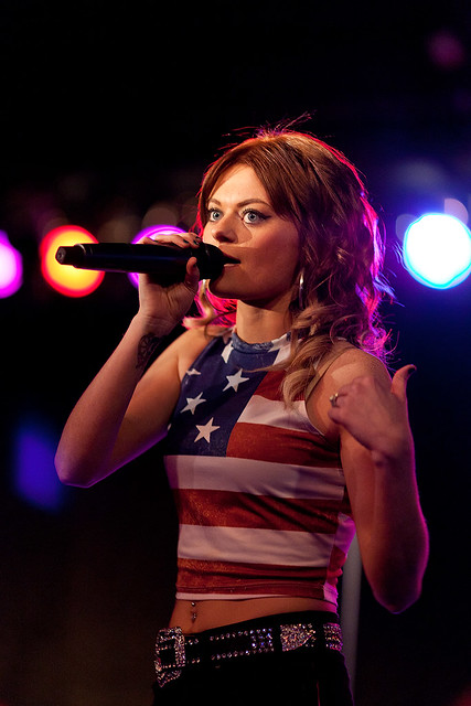
ParticipantAnd you’ve got some colour problems, look at the first two shots next to each other. One is almost correct but the other is bright red by comparison. Same with the last three. They are all young girls with similar skin tones but put next to each other and they look like they are from different planets.
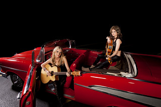
I like the shot of the two girls in the car but the black background is to dominant in the picture and looks cut out.
This girl looks cute
but she’s scary looking here.
 November 11, 2013 at 12:39 pm #15130Participant
@CC The first one is an old one, I’ll have to go back and look at the PSD to see what I actually did in post to that one. I wasn’t getting any shallower depth of field out of the lens. f4 is as good as it gets.
The “vampire” shot, now that I look at it wouldn’t make much sense to someone who wasn’t there. That’s the girl’s mother in the foreground. She was applying powder to her neck and shoulders, not sure why. I kind of looked at the shot as the mother fading a little as the daughter came into her own and being less dependent.
These were taken at a cheer leading competition. The last shot in your post was after the first set of girls had done their routine and we had returned to the room to get the older girls ready for theirs. This was really just a quick shot I took where the camera settings were still set for the competition. I should have planned it out a little better. The cheek problem is just a result of my clumsy attempt at skin retouching. This girl has a horrible acne problem. I just did my best without giving her plastic looking skin. If I ever posted something of her without retouching I would probably never get another shot of her.
Thank you for the help.
November 11, 2013 at 12:55 pm #15131Participant@WCS I see what you mean about the color shift. I didn’t take into account the light reflecting off of the bricks in the alley. I think I need to invest in a color checker passport.
The one of the girls in the car was taken in a church parking lot. The car shots were suppose to be done in daylight, but one of the girls ended up having to work that day and we got off to a late start and ran out of daylight. It was kind of a change of plans half assed thing. I just really wanted to use that car while we had access to it.
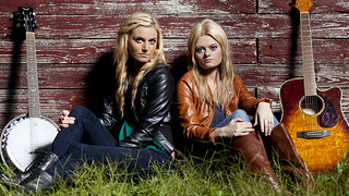
They bill themselves as “Pissed off country singers”, which fits in with the songs they sing. The one where they were sitting in front of the wall in the grass is one where they wanted something edgier. I guess I went a little too far with that concept there.
Thank you and I will work toward developing a color strategy.
-
AuthorPosts
- You must be logged in to reply to this topic.