Home › Forums › Am I a Fauxtog? › ???
- This topic has 19 replies, 7 voices, and was last updated 10 years, 7 months ago by
a.
-
AuthorPosts
-
September 5, 2013 at 6:04 pm #12650
a
ParticipantHi!
I’d love to hear what some feedback on my photography, good or bad. For those of you who take the time to look and comment, THANK YOU!
Here’s the site:
http://www.flickr.com/photos/96671646@N04/
Again positive or negative is fine, both would be excellent!
September 5, 2013 at 8:06 pm #12652cass335
ParticipantJust at a quick glance here are my first thoughts.
The first 4 have that “instagram” look. I really don’t care for it.
I don’t find the kite image interesting, it’s plain.
“Hannah 13” Not a good background, don’t like her hair over her face
Hannah 12: overexposed background, bad angle makes her look short.
Hannah 11: Bad expression on her face…she looks like she blinked as you took the photo. Don’t like where she is placed in the photo.
Hannah 10: Lens flair on her shoulder, not sure what’s going on with her hand, looks like you snapped it in the middle of her posing.
Hannah 9: Like her face and smile, seems a little dark. Would have cropped in tighter on her face.
Hannah 8: Cute, would have liked it better if you would have cropped below the sky. The sun is distracting and draws my eyes to it.
Hannah 7: Squatting is a no-no. IMO it always looks like they are having a bathroom break…
Hannah 6: She kinda has crazy eyes here, like she opened them wider than normal.
Hannah 5: Not sure what is going on with her eye the darkness makes it look weird…also looks like you over exposed and then tried to fix the highlights…resulting in greyish tones with no detail
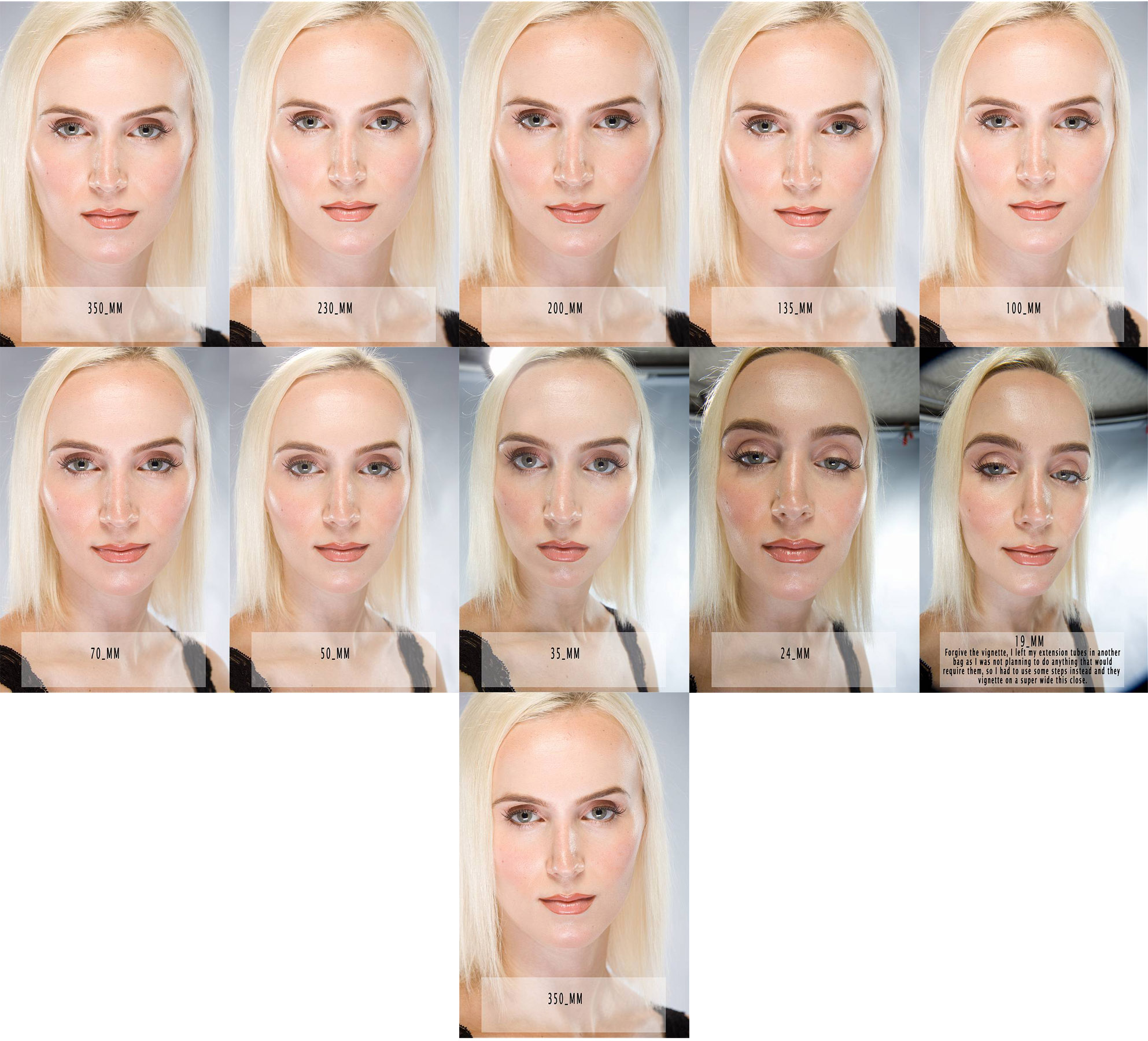
Hannah 4: Cute expression. Her legs look orange, and she has a tree growing out of her head. If the background was blurred more it would have helped that. Shooting at a longer focal length would have made the background look better
Hannah 3: One of your better images. I like the catch-lights in her eyes. Maybe crop a little off the left to put her more on the thirds line.
Hannah 2: Background looks better on this one. Hand across stomach is awkward.
Hannah 1: My eye is drawn to the bright part of the rock. Bent elbow and hand look awkward.
Ane’s Feet: Just a strange shot overall.
cake shot: Too shallow DOF, too dark, uninteresting
Sweet Ane: bad lighting. I really really dislike wrinkled backgrounds!
Smashing and dashing: Bad lighting, bad background
Ane cake smash: Bad lighting, bad background, not a fan of messy mouth closs-ups
Ane: Bad background, bad lighting, weird angle
Dad: not terrible lighting, his expression is odd.
Sunset: Nothing interesting just looks like a snapshot taken with a cell phone.
img_6084: better image. 30mm is not a good focal length for portraits. Try 50-70mm at that type of crop.
img_6120: Looks like a snapshot, bad background
img_6046: background too busy, not an awesome BW conversion
img_6036: Better image. Wish there was a little more space above her head. same comment about focal length.
Like I said…just a quick glance at each. I am sure someone will give you a much more in depth critique.
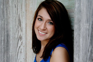
to see more information about focal lengths check out: http://www.lesjones.com/www/images/posts/stepheneastwood-tile1.jpg
September 5, 2013 at 8:44 pm #12656ParticipantThank you so much cass335 for taking the time to look and critique each and every single one, I really appreciate it! I will take your advice and put it to action.
September 5, 2013 at 11:11 pm #12658fstopper89
ParticipantI’ll comment on a few… it looks like you are on your way, but have a few things to work on.
Hannah 5 http://www.flickr.com/photos/96671646@N04/9565856180/
I agree with what Cass said, but also, what bothered me more was the tree right behind her head. No, it’s not in sharp focus which helps, but it really appears to be “growing out of her head” still. If you would have stepped a foot to the side, it could have been avoided. I love the bokeh though. It really sparkles. Maybe increase the contrast a little and fix her eye.
http://www.flickr.com/photos/96671646@N04/9563075725/
^ This one is quite nice. Lower the red saturation in her face a bit and maybe add a tiny bit of fill light. She’s cropped in a little tight; I’d like to see a little more of the background because it is beautiful. Even though her face seems slightly underexposed, you did a nice job not overexposing for her cream sweater.
http://www.flickr.com/photos/96671646@N04/9565872182/
^ Very nice posing. It looks natural. I know Cass didn’t like the hand across her stomach, but I actually kind of do… maybe that one is a matter of opinion. I think it works well because she is thin, but on an overweight person it would bring too much attention to that area. Again though slightly too red in the face but that can easily be fixed.
^ Great portrait, great connection with your subject, excellent exposure. The little bit of head cut off is somewhat bothersome but does not ruin the photo. It doesn’t particularly bother me but some might not like it.
http://www.flickr.com/photos/96671646@N04/9565816890/
^ Firepit in the background really pulls my attention away from the subject. Not as strong as your other portraits.
http://www.flickr.com/photos/96671646@N04/9563021033/
^ This one would have looked much better with a shallow depth of field. The angle is too high, creating foreshortening of her legs. Also the skin is quite orange.
September 5, 2013 at 11:26 pm #12659ParticipantWow! Browneyedgirl89, again thank you for taking the time to look through & critique my photos. I reaaallly appreciate it and will definitely work on everything you mentioned. *Internet high five*
September 6, 2013 at 6:07 am #12671Worst Case Scenario
ParticipantI read the first critique before looking at the pics and started out thinking ” these will be awful” but actually I really like a lot of them.
Like most people who post here, you have too many okay/meh shots between the good ones. 5 great shots are better than 20 average ones! Cull your portfolio.
Everything mentioned above is true and fair.
The only other thing I noticed was with this shot..
http://www.flickr.com/photos/96671646@N04/9565872182/
There’s some thing weird going on with her right hand, it looks like it’s been desaturated? 10 secs in PS would fix it.
September 6, 2013 at 6:26 am #12672cameraclicker
ParticipantThe yellow sweater is not the best choice. If you only see one photo, it looks like the sweater is desaturated too.
September 6, 2013 at 7:07 am #12673ParticipantWorst Case Scenario (I like that username btw), again, thank you for taking the time to look and help me. I’m going to start fixing everything tonight when I get off work, I’m so glad y’all continually help out others.
Cameraclicker, I see what you are saying, I’ll be sure to watch out for that next time. THANK YOU THANK YOU for helping this gal out!
September 6, 2013 at 1:47 pm #12678ebi
Participantthere isn’t really anything interesting to see here. Part of what you need to do is focus on something. There are all these kind of senior portrait setups mixed in with not very interesting element shots that don’t really go with anything else. Like the beginning feels like your trying to tell a beach story and then we abruptly move into some random portraits of a girl. Then baby then surfer then another girl.
I think you may have some potential with the first 5 images. I’d revisit that with another shoot. Start with the most interesting image in that entire set…this one: http://www.flickr.com/photos/96671646@N04/9670633205/
September 6, 2013 at 6:29 pm #12712ParticipantGreat! I will most definitely work on becoming more interesting, ebi. Oh, and thank you so much for looking and critiquing. I really appreciate it.
September 6, 2013 at 9:00 pm #12720Participanta, you are incredibly too nice and it’s creeping me out.
September 6, 2013 at 9:36 pm #12725Participantebi, I’m trying this new thing called anti-smartass (suggested by my father). Thought I’d apply it over the interwebs too. Really sucks ass to be honest.
September 6, 2013 at 10:55 pm #12729ParticipantI thought so. I was definitely picking up what you were putting down.
September 6, 2013 at 11:01 pm #12730ParticipantI like your spunk ebi.
September 7, 2013 at 7:56 am #12734ParticipantI like your spunk ebi.
Spits coffee over keyboard along with the rest of the UK!
-
AuthorPosts
- You must be logged in to reply to this topic.